Projector Reviews Images

Optoma W460 Business and Education Projector Review – Picture and Sound Quality

Posted on April 11, 2018 by Nikki Zelinger

Optoma W460 Business and Education Projector Review – Picture and Sound Quality: Color Modes, Video Image Quality, Text and Presentation Quality, Audio Quality

Color Modes

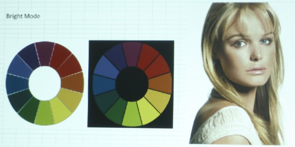
The Optoma W460 has six color modes: Presentation, Bright, Cinema, Blackboard, sRGB, and DICOM SIM. The brightest mode, aptly named “Bright,” has all the characteristics of a brightest mode. It is very strong on the greens and yellows, and in general, the colors are completely muddy. This is truly a “break glass in case of emergency” mode – only to be used in the most dire of ambient light circumstances.

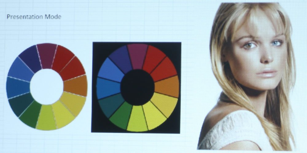
Presentation is one of the brighter modes, and as such, its color suffers a slight green/yellow tinge. I noticed that the reds, oranges, and yellows all have a muddy look to them, which is typical of DLPs – to have wine reds and mustard yellows. This is one of the reasons I don’t tend to favor DLPs – I generally find the colors to be a bit off in ways that I don’t care for. No matter – there is at least one mode that does really well in terms of color, even though it, too, is a tad off.

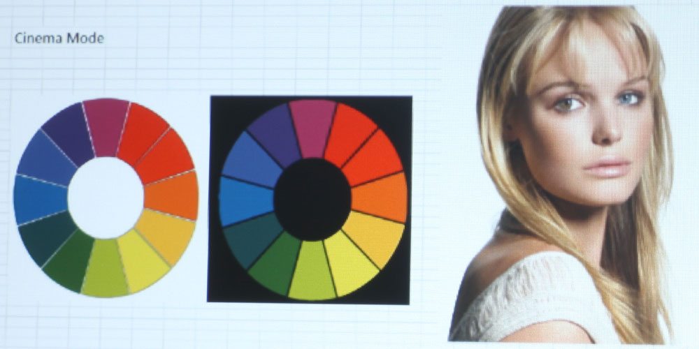
That mode is called Cinema. This is as true to color as you’re going to get on the Optoma W460. It does a great job on skin tones, with all colors looking pretty natural in most cases. The only thing I noticed is that in some instances, the color leans a bit toward the warmer side, with perhaps the slightest yellow tinge. No matter. The colors are vibrant and in general, look the way you would expect them to. This will be the best mode in terms of color, and it is bright enough to handle ambient light – more on that on the next page. When a projector has one mode with good color and brightness, I'm happy – that's something to work with.

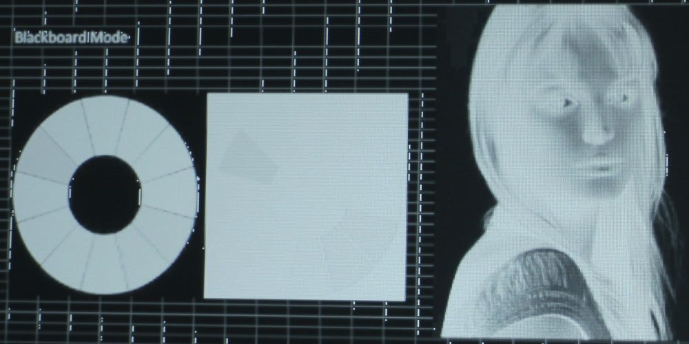
The next mode is Blackboard, which is to be used on the archaic blackboard surface seen in classrooms of old. These days, classrooms tend to favor a whiteboard, or an interactive Smart Board, but it is nice that several manufacturers, such as Optoma, Sony, and Epson, keep a mode that may make projectors more accessible to certain schools. That said, I couldn’t accurately test the color on this one, having no blackboard surface of my own, but I will say that it should work just fine, as the colors are completely inverted. I would be interested to see what that looks like on a blackboard.

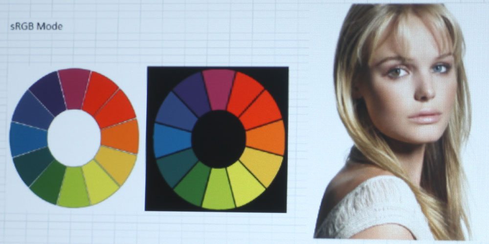
sRGB would be the second best mode, which seems to be a more muted and desaturated version of Cinema mode. It is also on the cooler side – something made quite visible by toggling between the two images in the slider. I did like the color of this mode, but favored Cinema because it is brighter and does a better job on skin tones. It would look good on presentations and other text documents where the emphasis is not on skin tones.

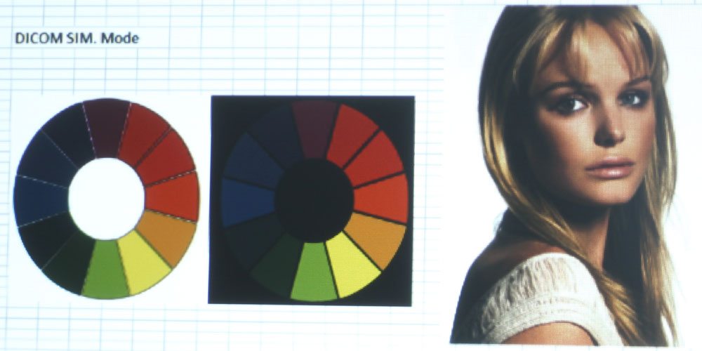
The final mode is DICOM SIM., which is a mode intended for viewing high contrast material such as X-Ray films. The inclusion of the mode makes this projector one that can be used in hospitals and doctors offices, as well as in classrooms where X-Ray films might be shown. When I was a senior in high school, I took a veterinary assisting course to become certified to work in a clinic, and we had a projector such as this to view X-Rays. Of course, back then, I paid zero attention to what kind of projector it was. In any case, the Optoma W460 would be suitable for a classroom situation like that.

Video Image Quality

The Optoma W460 does a great job on skin tones when in Cinema mode. This, as mentioned, is the projector’s best mode. It has the most accurate color, with only minor discrepancies. For instance, blues have a little yellow in them, making them a more aqua color rather than true-blue. It’s not so much as to distract from viewing – in fact, you’re bound not to notice. It is only because I have seen Journey to Space 1,000 times that I was able to detect anything at all.

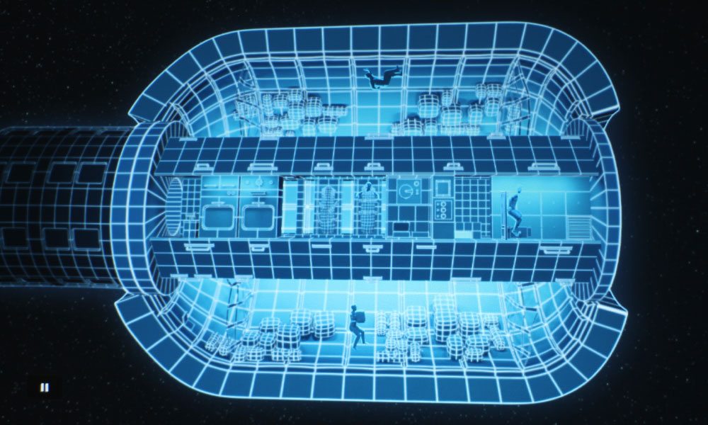
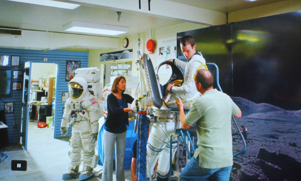
There is a scene from Journey to Space that is color corrected to be quite yellow, and it wasn’t helped along by this projector’s tendency to favor yellow. That’s the scene with the EVA suit and astronaut. Overall, the Optoma’s video image quality is good, especially as it was being fed 1080p content. The better the resolution being fed into the projector, the better the projected image will look, as a general rule of thumb.

Fun fact – this is also true of video image quality in terms of video footage. If you shoot at 1080p and compress down to 720p, the footage will look better than footage shot at 720p. Alternatively, footage shot at 4K resolution compressed down to 1080p will look better than footage shot at 1080p. Alright, enough anecdotes. Onto text and presentation quality!

Text and Presentation Quality

Text and presentation quality is decent, but not the sharpest. I just reviewed a similarly priced Sony with WXGA resolution – the same as this Optoma – and was more impressed on its ability to handle text. Now, the laptop I use doesn’t have the best graphics card or resolution (it’s a 1388 x 768, which is similar to the W460’s 1280 x 800), so it doesn’t look as good as it would if I projected from my iMac, which has 1920 x 1080 resolution.

For my next reviews, I will be screen mirroring my iMac with the Apple TV hooked up to the projector, and use my wireless keyboard and Magic Mouse, because I’m really not happy with the way the laptop looks when projected by any projector, WXGA or WUXGA aside. That said, I think the Optoma W460 is decently sharp on text, with 16 point font and above being the most clear. 12-point is still readable, but its pixels run together with some adjacent letters.

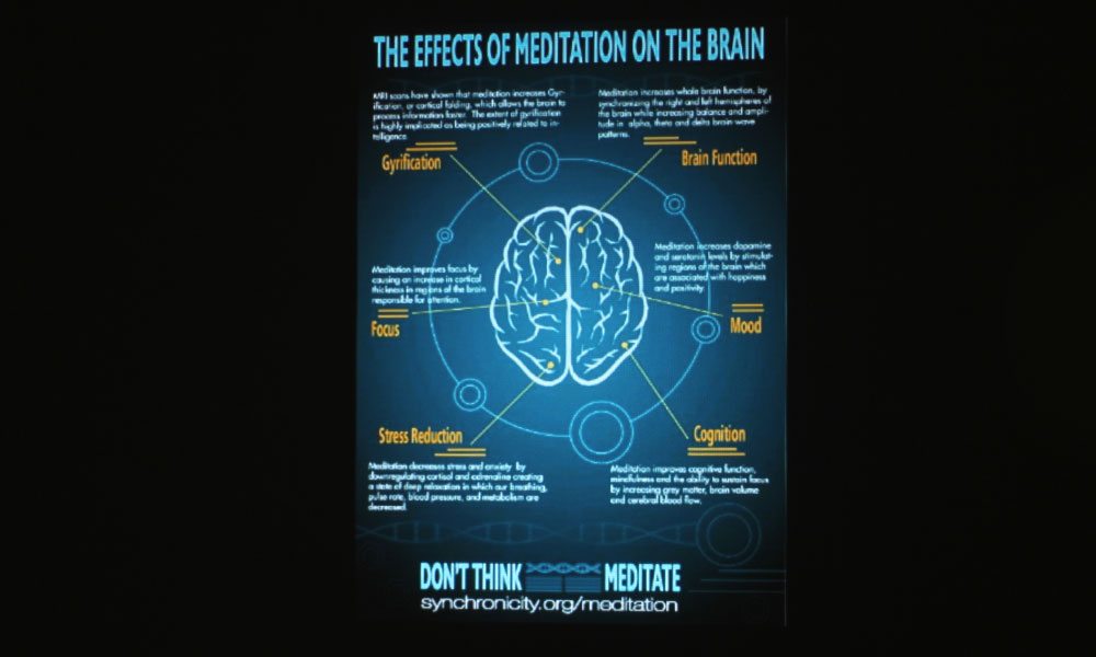
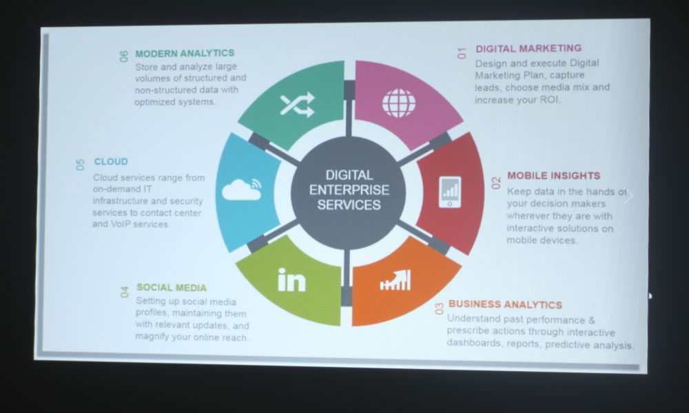
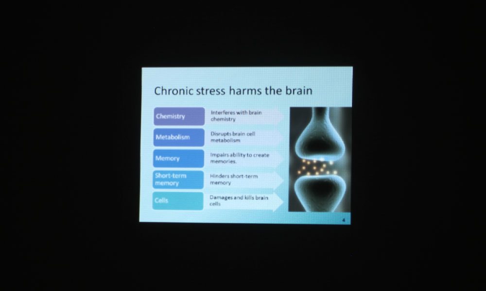
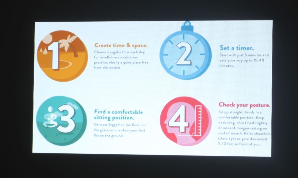
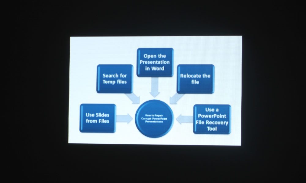
Check out the photos in the slider to see how presentations and websites look on the W460. Just know that the projector does look better in person, as there is always some loss of data when photographing these images. If the photos look presentable to you, imagine how much better it will look before your eyes.

Audio Quality

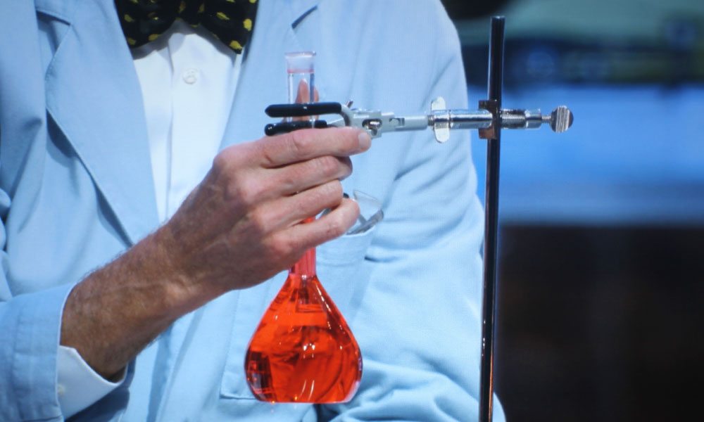
The Optoma W460 has a single 10-watt mono speaker. It is loud enough for a small to medium sized classroom or conference room. When taking my photos of Bill Nye Saves The World and Journey to Space, the audio came in loud and clear. I could even hear the audio through the walls of my house, when testing its ability to be heard from other rooms.

The speaker is located on the bottom of the projector, but this doesn’t seem to have any negative effect on the sound quality. It’s a small projector that will not likely be used for a large venue environment, so the speaker should do just fine in yours. If using the projector in a lecture hall or house of worship, you will need to utilize the facility’s sound system.

Next up is our discussion of the projector’s performance in terms of brightness, contrast, and audible noise! Click the button below to navigate to the next page.

Optoma W460 Business and Education Projector Review – Picture and Sound Quality: Color Modes, Video Image Quality, Text and Presentation Quality, Audio Quality

Color Modes

The Optoma W460 has six color modes: Presentation, Bright, Cinema, Blackboard, sRGB, and DICOM SIM. The brightest mode, aptly named “Bright,” has all the characteristics of a brightest mode. It is very strong on the greens and yellows, and in general, the colors are completely muddy. This is truly a “break glass in case of emergency” mode – only to be used in the most dire of ambient light circumstances.

Presentation is one of the brighter modes, and as such, its color suffers a slight green/yellow tinge. I noticed that the reds, oranges, and yellows all have a muddy look to them, which is typical of DLPs – to have wine reds and mustard yellows. This is one of the reasons I don’t tend to favor DLPs – I generally find the colors to be a bit off in ways that I don’t care for. No matter – there is at least one mode that does really well in terms of color, even though it, too, is a tad off.

That mode is called Cinema. This is as true to color as you’re going to get on the Optoma W460. It does a great job on skin tones, with all colors looking pretty natural in most cases. The only thing I noticed is that in some instances, the color leans a bit toward the warmer side, with perhaps the slightest yellow tinge. No matter. The colors are vibrant and in general, look the way you would expect them to. This will be the best mode in terms of color, and it is bright enough to handle ambient light – more on that on the next page. When a projector has one mode with good color and brightness, I'm happy – that's something to work with.

The next mode is Blackboard, which is to be used on the archaic blackboard surface seen in classrooms of old. These days, classrooms tend to favor a whiteboard, or an interactive Smart Board, but it is nice that several manufacturers, such as Optoma, Sony, and Epson, keep a mode that may make projectors more accessible to certain schools. That said, I couldn’t accurately test the color on this one, having no blackboard surface of my own, but I will say that it should work just fine, as the colors are completely inverted. I would be interested to see what that looks like on a blackboard.

sRGB would be the second best mode, which seems to be a more muted and desaturated version of Cinema mode. It is also on the cooler side – something made quite visible by toggling between the two images in the slider. I did like the color of this mode, but favored Cinema because it is brighter and does a better job on skin tones. It would look good on presentations and other text documents where the emphasis is not on skin tones.

The final mode is DICOM SIM., which is a mode intended for viewing high contrast material such as X-Ray films. The inclusion of the mode makes this projector one that can be used in hospitals and doctors offices, as well as in classrooms where X-Ray films might be shown. When I was a senior in high school, I took a veterinary assisting course to become certified to work in a clinic, and we had a projector such as this to view X-Rays. Of course, back then, I paid zero attention to what kind of projector it was. In any case, the Optoma W460 would be suitable for a classroom situation like that.
Video Image Quality

The Optoma W460 does a great job on skin tones when in Cinema mode. This, as mentioned, is the projector’s best mode. It has the most accurate color, with only minor discrepancies. For instance, blues have a little yellow in them, making them a more aqua color rather than true-blue. It’s not so much as to distract from viewing – in fact, you’re bound not to notice. It is only because I have seen Journey to Space 1,000 times that I was able to detect anything at all.

There is a scene from Journey to Space that is color corrected to be quite yellow, and it wasn’t helped along by this projector’s tendency to favor yellow. That’s the scene with the EVA suit and astronaut. Overall, the Optoma’s video image quality is good, especially as it was being fed 1080p content. The better the resolution being fed into the projector, the better the projected image will look, as a general rule of thumb.

Fun fact – this is also true of video image quality in terms of video footage. If you shoot at 1080p and compress down to 720p, the footage will look better than footage shot at 720p. Alternatively, footage shot at 4K resolution compressed down to 1080p will look better than footage shot at 1080p. Alright, enough anecdotes. Onto text and presentation quality!

Text and Presentation Quality

Text and presentation quality is decent, but not the sharpest. I just reviewed a similarly priced Sony with WXGA resolution – the same as this Optoma – and was more impressed on its ability to handle text. Now, the laptop I use doesn’t have the best graphics card or resolution (it’s a 1388 x 768, which is similar to the W460’s 1280 x 800), so it doesn’t look as good as it would if I projected from my iMac, which has 1920 x 1080 resolution.

For my next reviews, I will be screen mirroring my iMac with the Apple TV hooked up to the projector, and use my wireless keyboard and Magic Mouse, because I’m really not happy with the way the laptop looks when projected by any projector, WXGA or WUXGA aside. That said, I think the Optoma W460 is decently sharp on text, with 16 point font and above being the most clear. 12-point is still readable, but its pixels run together with some adjacent letters.

Check out the photos in the slider to see how presentations and websites look on the W460. Just know that the projector does look better in person, as there is always some loss of data when photographing these images. If the photos look presentable to you, imagine how much better it will look before your eyes.

Audio Quality

The Optoma W460 has a single 10-watt mono speaker. It is loud enough for a small to medium sized classroom or conference room. When taking my photos of Bill Nye Saves The World and Journey to Space, the audio came in loud and clear. I could even hear the audio through the walls of my house, when testing its ability to be heard from other rooms.

The speaker is located on the bottom of the projector, but this doesn’t seem to have any negative effect on the sound quality. It’s a small projector that will not likely be used for a large venue environment, so the speaker should do just fine in yours. If using the projector in a lecture hall or house of worship, you will need to utilize the facility’s sound system.

Next up is our discussion of the projector’s performance in terms of brightness, contrast, and audible noise! Click the button below to navigate to the next page.

© 2024 Projector Reviews

crossmenu linkedin facebook pinterest youtube rss twitter instagram facebook-blank rss-blank linkedin-blank pinterest youtube twitter instagram