Optoma UHD65 Calibration Presets notes
Eric's notes:
Note: The projector had over 32 Hours on the bulb before I calibrated it and took the light measurements. A brand-new bulb will most likely have slightly higher measured lumens.
The UHD65 has 7 modes: Bright, Vivid, Game, Cinema, Reference, User and HDR. It also has 2 locked ISF (day/night) modes. I spent most of my time with Reference, Vivid and HDR. All of these modes have the same controls, what sets them apart is how these controls are preset. They all offer 4 color temperature options (Normal, Cool, Warm, Native Bulb), 2-point grayscale adjustments, gamma presets 1.6 – 2.8 and full CMS (color management system). Note: In order to change one of the 4 color temperature presets, you must first turn off Brilliant Color. After you select you preferred color temp you can turn Brilliant Color back on if you wish.
During my calibration of UHD65 I experienced an issue with white level clipping. Basically, no matter what mode I was in the whites would clip below 235 no matter where or how low I set the contrast. I was unable to resolve anything higher than 228. Now maybe that sounds very close and I’m nit picking, but what bothered me was the fact that it could not be corrected. When working properly I should have been able to affect the white point a with the contrast control.
Normally with most modern digital projectors when you over drive the white level (contrast) you will start to clip the whites, loosing detail in the brightest part of the image. Most projectors will clip just above their default contrast values which are often set at their 50% mark. “Video” levels are 16-235 while PC levels are 0 -255. When I calibrate any display, I set the black level (brightness) to resolve down to 16 and the white level (contrast) to 242 or so. I like to have a tiny bit of head room in the whites just in case there is some content that sneaks in higher than 235.
I preformed my dark room calibration using Reference mode as a starting point. Brilliant color is to 1 (out of 10) by default and I left it there for my calibration.
Sharpness was defaulted to 8, I set it to 5. UltraDetail was set to 0. I found I could push it to 1 before seeing any objectional artifacts when viewing 1080p content. I kept Dynamic Black off. There is also a section called PureEngine that has 3 more enhancements called PureContrast, PureColor & PureMotion all are off by default and I kept them off.
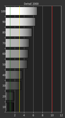
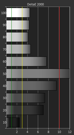
Reference out of the box performed decently but it did show 2 - 6 DeltaE between 10 – 100 IRE. Remember we want to be below 3 and I always strive to hit 1 or less if the projector is capable. The average color temp was 5990K range, a bit warmer (plus red) than our target of 6500K (D65). After calibration, I was able to hit 2 or less DeltaE across the entire grayscale (10 – 100 IRE)
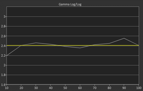
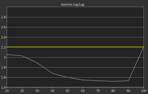
My target gamma for Reference mode is 2.4 and my pre-calibration measured very close to that with an average of 2.34, however the gamma curve is not very linear with some peaks and valleys most notably at 20, 30, 60 & 90 IRE. After my 2-point grayscale calibration a slight improvement was gained resulting in a 2.40 average gamma.
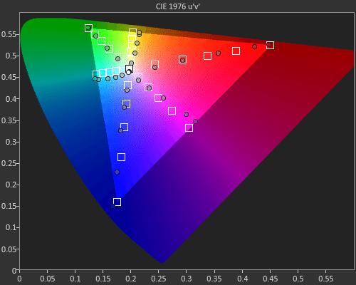
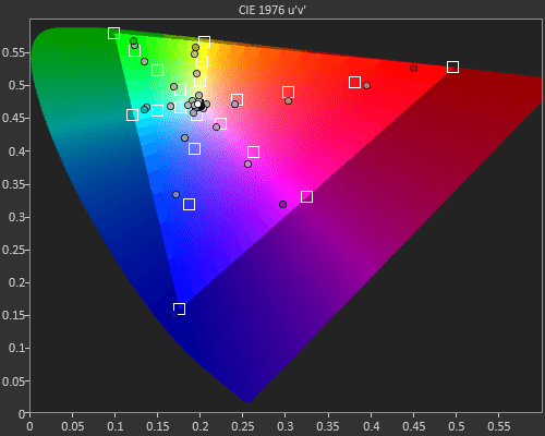
Color performance (base on measurements) was a little disappointing and using the projectors CMS (color management control) did little to help things. It didn’t seem to make any real difference which color gamut preset I choose. Our target is REC.709 and while all 6 colors (except red) were able to hit there 100% saturation targets, it’s the lower in-between levels (i.e 80% 60% 40% etc) that had some issues. Red, green, blue & magenta’s lower levels are all over saturated with green also going towards blue in its higher saturation levels. If I tried to lower those mid-level saturation points it would also lower the 100% saturation points reducing the REC.709 color gamut, something we don’t want to do. Now to be fair I have seen this issue with other DLP projectors, like the recently reviewed Benq 8050.
Next up I did a bright room calibration using Vivid mode. Because I’m trying to get the brightest acceptable image as possible I set Brilliant Color to 10. By default, Vivid uses a very bright (graphics) gamma curve and a cool (D75) color temperature. After calibration, both the gamma and the grayscale hit their respective targets of 2.2 and 6500 (D65) with a DeltaE of 2 or lower across the entire grayscale (10 – 100 IRE). The results were much like what I got from Reference mode with the only real difference of a slightly brighter 2.2 gamma target.
As with Reference mode Sharpness was defaulted to 8, I set it to 5. UltraDetail was set to 2, I turned it down to 1 like I did in Reference mode. I kept Dynamic Black off. PureContrast was set to off, PureColor was set to 1 & PureMotion was set to 3, I turned them all off.
Also, as with Reference mode the performance of the color gamut (REC.709) was similar but oddly showed slightly small improvements with some colors while others were slightly worse.
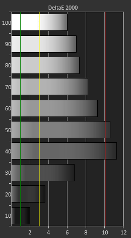
Lastly, I performed an UHD 4K/HDR calibration using the HDR mode. White balance was pushing red when set to the D65 preset. After calibration, I was able to get the DeltaE down from 12 to just about 3 and lower. Brilliant Color is set to 10 by default and I left it there as it increases the lumen output and we want as much as he can get for HDR.
The UHD65 has 4 HDR gamma presets, (standard, bright, film & detail). Standard measured the most accurate and is the one I used for calibration. It was set to Bright by default. Bright is brighter between 40 to 70 IRE, Film is darker between 20 & 60 IRE, and Detail is darker from 20 to 70 IRE. I turned sharpness down to 5 from 8. UltraDetail was set to 1 and I left there. I kept Dynamic Black off. PureContrast was set to off, PureColor was set to 1 & PureMotion was set to 1, I turned them all off.
Now finally we move on to color gamut but first a word from Optoma’s marketing material: “HDR10 produces the brightest whites, deepest blacks, and life-like color due to the REC.2020 wide color gamut and DCI-P3 color gamut coverage”. So, as I interpret that statement the UHD65 can produce (cover) the P3 color gamut. Well I tried all of the gamma presets (native, cinema, HDTV & presentation) and all of them were quite similar to each other. I had already used HDTV & Cinema for my dark and bright room calibrations so I choose native for 4K/HDR.
Take a look at my HDR Mode saturation sweeps and you can see that blue is the only color that makes it out to P3 with magenta getting very close, all of the other colors especially red fall short by a bit. But more disappointing is the fact that just like REC.709 the lower saturation levels of all the colors except blue are over saturated. Calibration helped a tiny bit but nothing to write home about. Now how does all this relate to actual color performance in video content? I’ll let Art tackle that question.
P.S. If you want to see a near perfect (90% +) P3 color gamut from a faux K projector, check out Art’s review of the Epson LS10500.