Projector Reviews Images

Optoma EH330UST Business/Education Projector Review – Picture and Sound Quality

Posted on February 22, 2019 by Nikki Zelinger

Optoma EH330UST Projector Review – Picture and Sound Quality: Color Modes, Video Image Quality, Text and Presentation Quality, Audio Quality

Color Modes

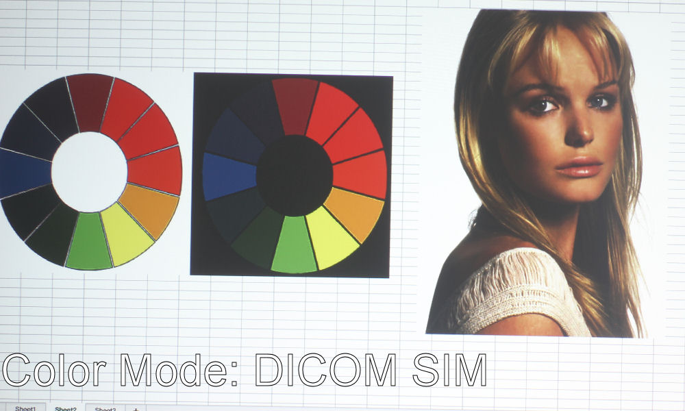
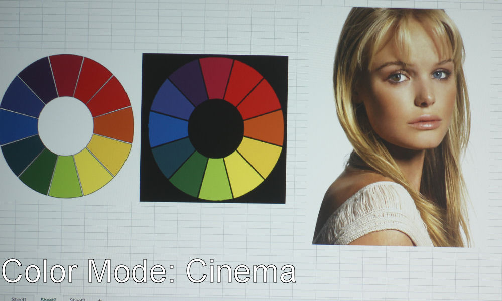
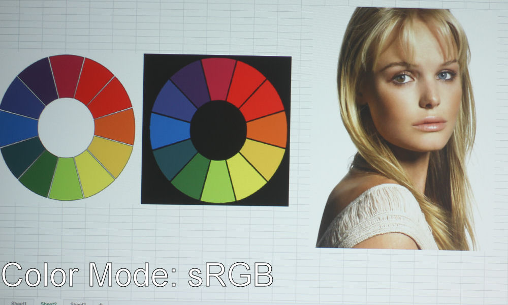
The Optoma EH330UST has good color in several modes. Being a DLP projector, it does have the characteristic wine-reds and mustard-yellows, though not as bad as some of the other DLP projectors I’ve seen. If it weren’t for the color wheel images, I might not have even noticed this slight color shift in those two colors. It has an RGBWYK color wheel, so it has more to work with than a standard RGBW, resulting in more accurate colors.

Of all the modes, Cinema has the best-looking color, with sRGB close behind. If you notice in the slider above, the photos of the color wheels have two reds that look exactly the same. They’re meant to be different colors – one slightly darker than the other – but this is hardly ever the case with projectors’ color modes. sRGB’s reds look more true red, if not a tad too orange, while Cinema’s are that classic DLP wine-red we talked about. Still, I favor Cinema’s color over sRGB.

I’d actually call Game Mode the next best mode, as skin tones look more natural (although a bit too yellow for my tastes) than Presentation Mode. Presentation Mode is a more cool tone than any of the other modes, which does look really good on presentations, documents, websites, etc. – particularly those with white backgrounds. The blue hue counteracts any yellow, making whites look true-white rather than creamy. This will be your best mode for presentations, or in instances where the projector is up against a lot of ambient light.

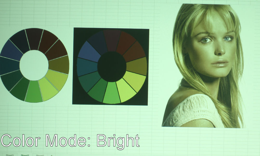
Bright Mode is just like, the worst thing ever. All brightest modes on projectors look pretty bad, as a general rule of thumb, with the occasional exception. Lots of greens and yellows. As you can see from the photo, the Optoma’s Bright Mode definitely ghastly green. We call these brightest modes your “Break Glass in Case of Emergency Mode” – I think you could improve Bright Mode some, but not enough to justify using it unless you’re up against the most dire of ambient light scenarios. The last mode to talk about is DICOM SIM., which is used for viewing high contrast films like X-Rays.

Video Image Quality

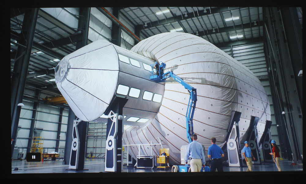
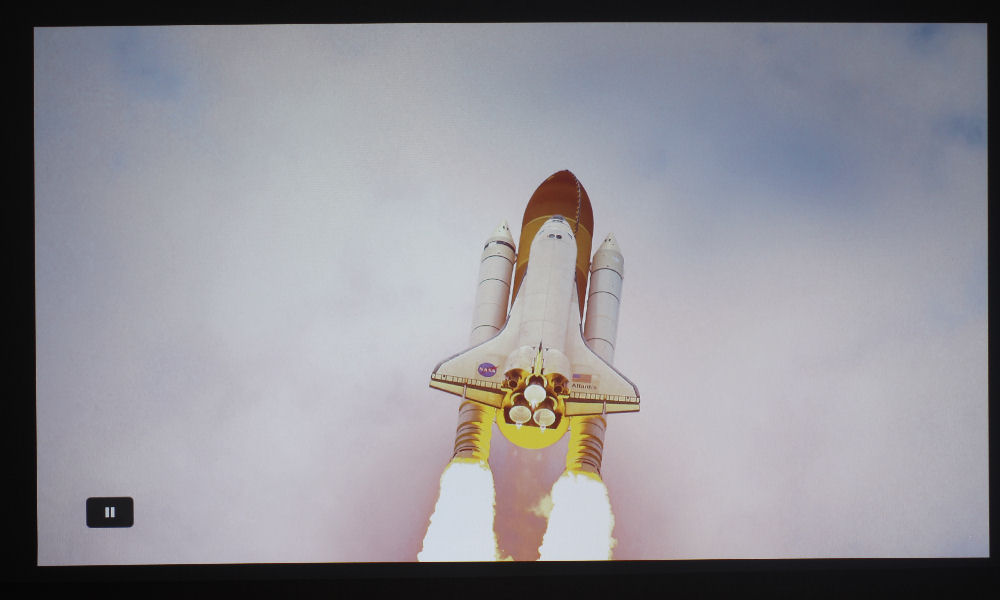
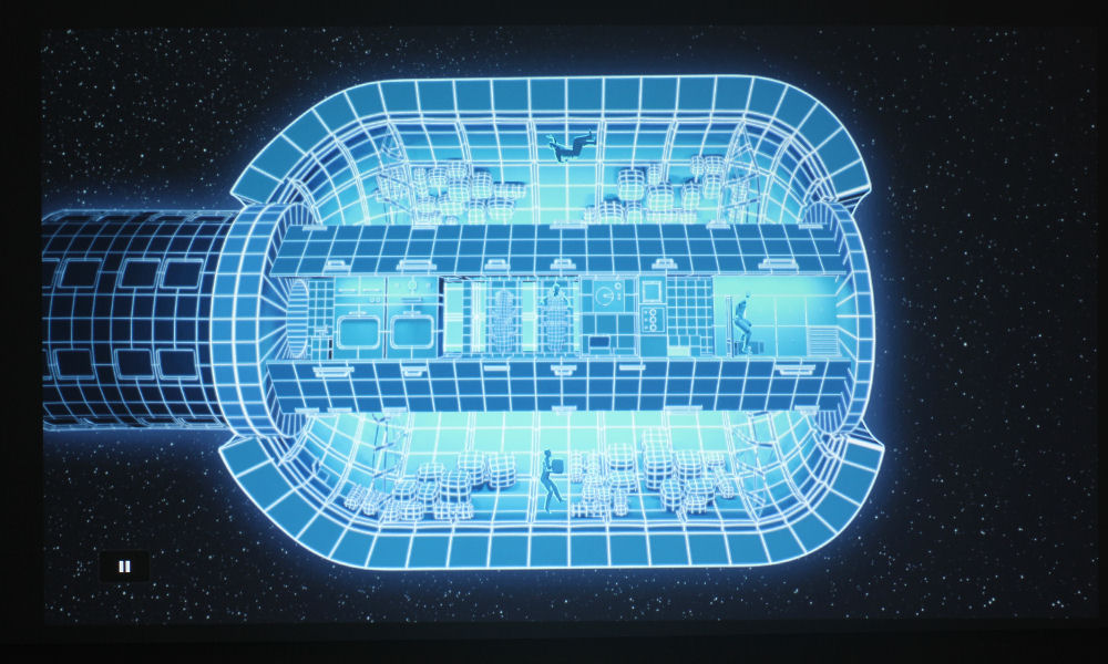
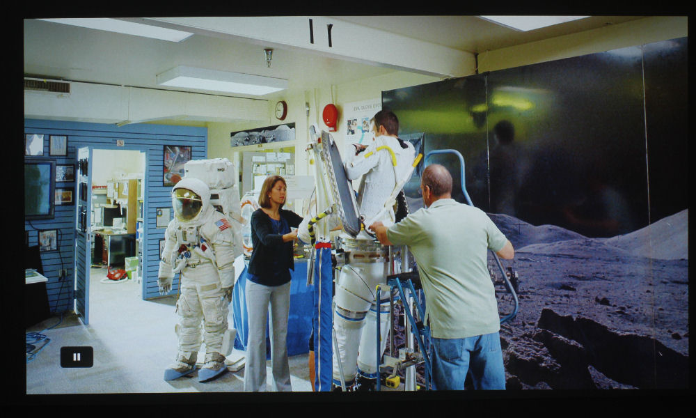
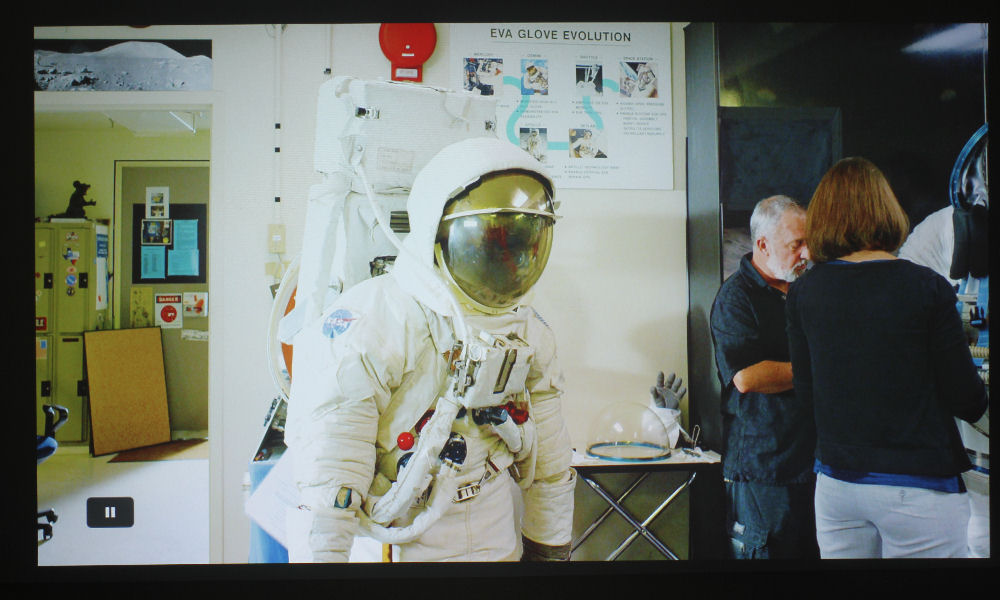
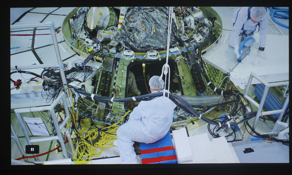
I started my photo-taking process with Journey to Space. I have the 4K edition, which comes with a combination Blu-ray disk that features a 2D and a 3D version. The projector did not like this. Though it can do 3D, and 3D well from what I gather, I experienced a minor irritation when trying to play the 2D version. The projector asked me if I wanted to turn 3D on – I selected No, then proceeded to play the 2D film. Only, when I went to change the color mode to Cinema, everything was greyed out! The only mode I could choose was “3D” or “User.”

3D, which is only available to choose when a 3D Blu-ray is inserted into your player, looked ugly, so I changed it to User. Also ugly. So, I went into the menus and used the basic controls to change the color and tint, and I managed to get the color looking pretty good. So, when looking at the photos of Journey to Space in the player above, know that they were taken in my self-calibrated User Mode. The rest of the photos were taken in Cinema Mode.

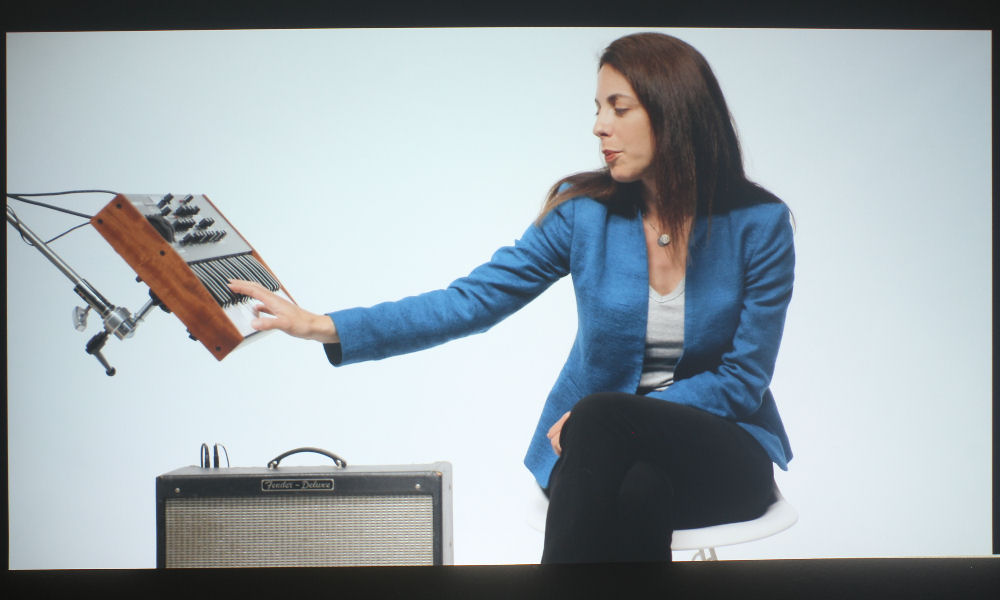
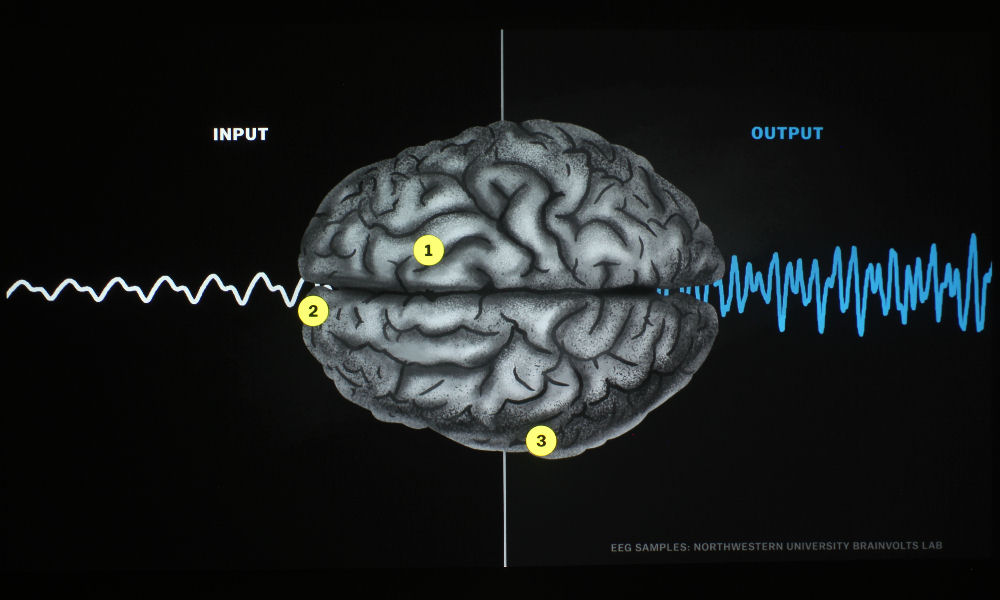
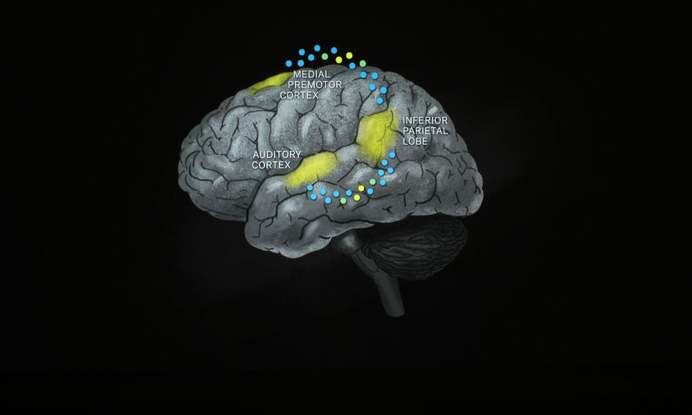
The image itself is crisp and clean. Even with User Mode, Journey to Space looked great, as did the videos from the Netflix show, “Explained.” The resolution is 1080p, so it’s really not surprising that it would look good in terms of sharpness. Oh, and something I should mention: DLP projectors use color wheels (in this case, a 6-segment color wheel), and some of those projectors have wheels that spin slowly, producing what we call the Rainbow Effect. Only about 5% or so of the population can see these rainbows, myself included, but I don’t have anything to report in terms of rainbows when it comes to the Optoma EH330UST!

Text and Presentation Quality

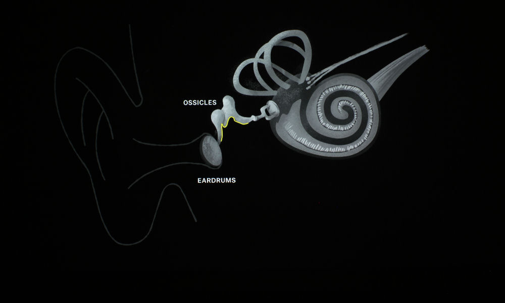
Text is nicely sharp on the Optoma EH330UST. Being 1080p, I wasn’t surprised. I could read 8-point text from around twenty feet back. It was tiny, to be sure, and it’s unlikely that you’ll ever have content with such a small font, but it’s nice to know its crisp at that size all the same.

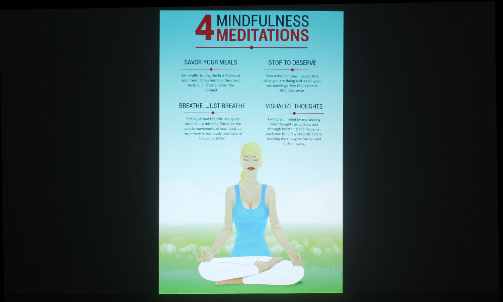
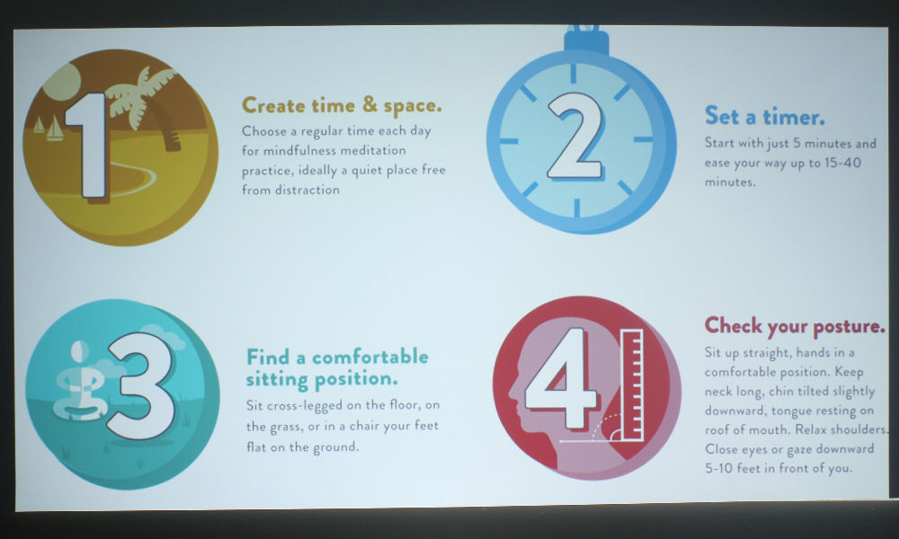
12-point font looked great – websites and infographics were easily readable from a distance, so if your applications involve reading documents, viewing web material, or other such things that have a standard size font, the EH330UST will not disappoint.

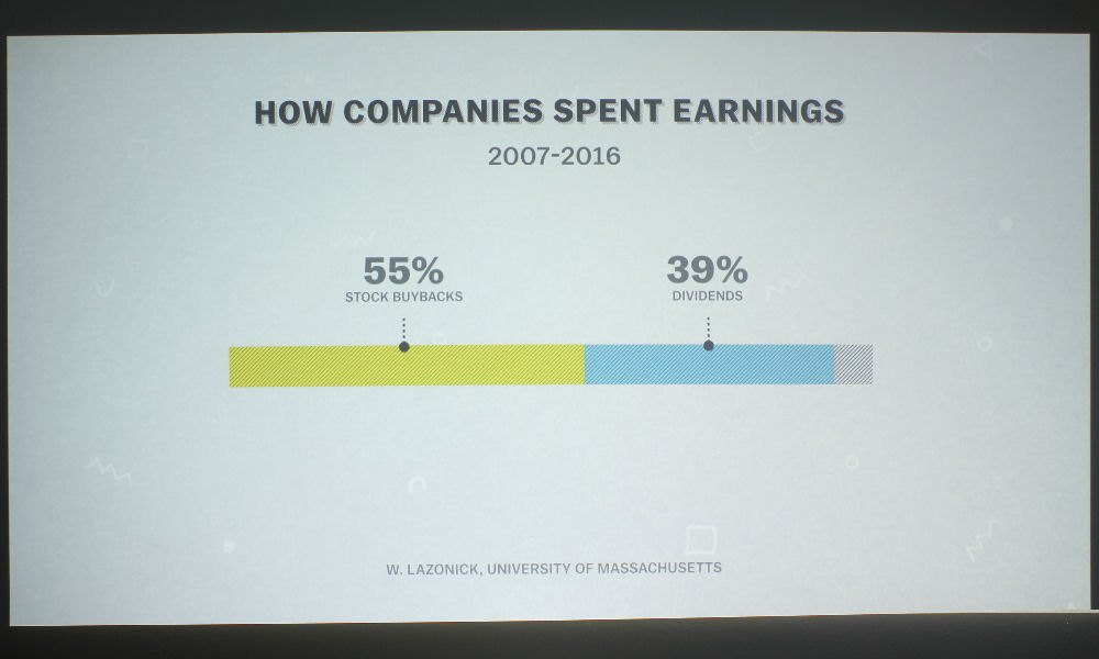
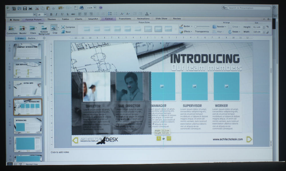
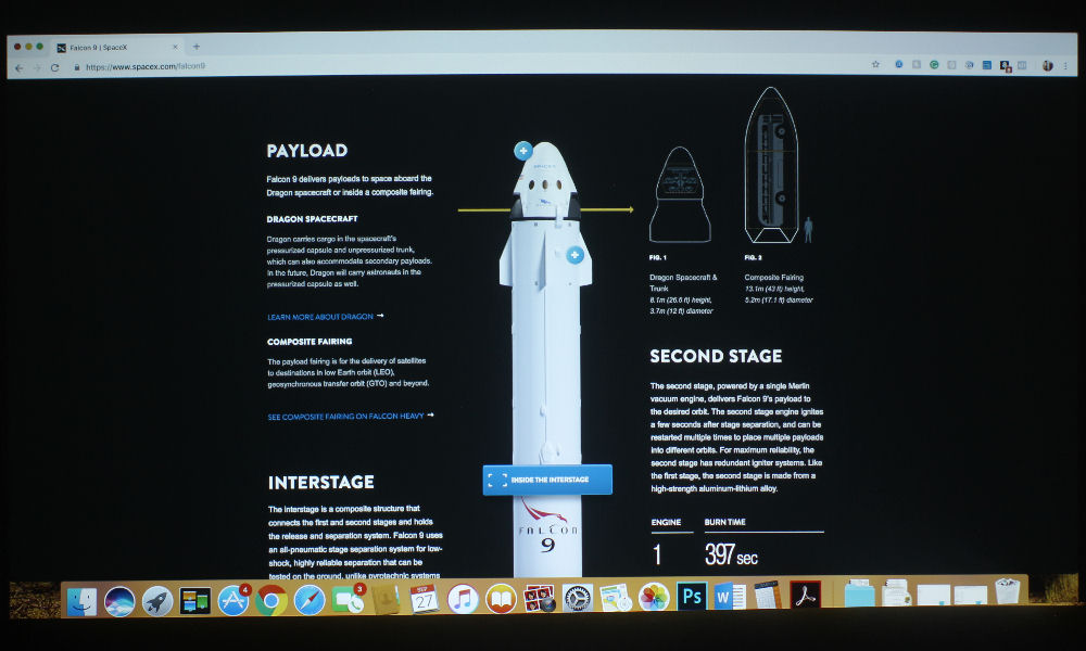
PowerPoint presentations, and other such material that has larger font, looked great. I took all of the photos in the slider above using Presentation Mode, which, as you know, has pretty good color. I chose this one because it will likely be the one used when projecting this type of content. It’s not totally true to color, but for most, it’ll do nicely. Cinema Mode is the alternative option, as it is bright and has excellent color.

Audio Quality

The Optoma EH330UST has a built-in 16-watt mono speaker. I found it to be quite loud even at medium volume. It’ll be loud enough for a large K-12 classroom, boardrooms, and conference rooms, even if there’s a bit of chatter. The EH330UST has crisp audio, but that audio is lacking in any real bass. This is typical of built-in speakers.

In a typical business or education environment, you don’t really need excellent sound quality – as long as you can hear it, and the audio is clear, most people couldn’t give a rip about bass. The projector does have the option to use an external sound system via the Audio Out jack on the inputs and connectors panel, and if you want great sound – say, if you’re teaching a film and literature class – then I’d go ahead and do that. There are inexpensive stereo speakers that will allow students to fully immerse themselves in what is being shown.

That’s it for our discussion of Picture and Sound Quality! Next up, we’ll dive into how this projector performed in terms of brightness, ambient light, contrast, and audible noise. Then, we’ll wrap it all up on the Summary Page where you’ll get some pros and cons of this projector. See you on the Performance Page!

Optoma EH330UST Projector Review – Picture and Sound Quality: Color Modes, Video Image Quality, Text and Presentation Quality, Audio Quality

Color Modes

The Optoma EH330UST has good color in several modes. Being a DLP projector, it does have the characteristic wine-reds and mustard-yellows, though not as bad as some of the other DLP projectors I’ve seen. If it weren’t for the color wheel images, I might not have even noticed this slight color shift in those two colors. It has an RGBWYK color wheel, so it has more to work with than a standard RGBW, resulting in more accurate colors.

Of all the modes, Cinema has the best-looking color, with sRGB close behind. If you notice in the slider above, the photos of the color wheels have two reds that look exactly the same. They’re meant to be different colors – one slightly darker than the other – but this is hardly ever the case with projectors’ color modes. sRGB’s reds look more true red, if not a tad too orange, while Cinema’s are that classic DLP wine-red we talked about. Still, I favor Cinema’s color over sRGB.

I’d actually call Game Mode the next best mode, as skin tones look more natural (although a bit too yellow for my tastes) than Presentation Mode. Presentation Mode is a more cool tone than any of the other modes, which does look really good on presentations, documents, websites, etc. – particularly those with white backgrounds. The blue hue counteracts any yellow, making whites look true-white rather than creamy. This will be your best mode for presentations, or in instances where the projector is up against a lot of ambient light.

Bright Mode is just like, the worst thing ever. All brightest modes on projectors look pretty bad, as a general rule of thumb, with the occasional exception. Lots of greens and yellows. As you can see from the photo, the Optoma’s Bright Mode definitely ghastly green. We call these brightest modes your “Break Glass in Case of Emergency Mode” – I think you could improve Bright Mode some, but not enough to justify using it unless you’re up against the most dire of ambient light scenarios. The last mode to talk about is DICOM SIM., which is used for viewing high contrast films like X-Rays.
Video Image Quality

I started my photo-taking process with Journey to Space. I have the 4K edition, which comes with a combination Blu-ray disk that features a 2D and a 3D version. The projector did not like this. Though it can do 3D, and 3D well from what I gather, I experienced a minor irritation when trying to play the 2D version. The projector asked me if I wanted to turn 3D on – I selected No, then proceeded to play the 2D film. Only, when I went to change the color mode to Cinema, everything was greyed out! The only mode I could choose was “3D” or “User.”

3D, which is only available to choose when a 3D Blu-ray is inserted into your player, looked ugly, so I changed it to User. Also ugly. So, I went into the menus and used the basic controls to change the color and tint, and I managed to get the color looking pretty good. So, when looking at the photos of Journey to Space in the player above, know that they were taken in my self-calibrated User Mode. The rest of the photos were taken in Cinema Mode.

The image itself is crisp and clean. Even with User Mode, Journey to Space looked great, as did the videos from the Netflix show, “Explained.” The resolution is 1080p, so it’s really not surprising that it would look good in terms of sharpness. Oh, and something I should mention: DLP projectors use color wheels (in this case, a 6-segment color wheel), and some of those projectors have wheels that spin slowly, producing what we call the Rainbow Effect. Only about 5% or so of the population can see these rainbows, myself included, but I don’t have anything to report in terms of rainbows when it comes to the Optoma EH330UST!

Text and Presentation Quality

Text is nicely sharp on the Optoma EH330UST. Being 1080p, I wasn’t surprised. I could read 8-point text from around twenty feet back. It was tiny, to be sure, and it’s unlikely that you’ll ever have content with such a small font, but it’s nice to know its crisp at that size all the same.

12-point font looked great – websites and infographics were easily readable from a distance, so if your applications involve reading documents, viewing web material, or other such things that have a standard size font, the EH330UST will not disappoint.

PowerPoint presentations, and other such material that has larger font, looked great. I took all of the photos in the slider above using Presentation Mode, which, as you know, has pretty good color. I chose this one because it will likely be the one used when projecting this type of content. It’s not totally true to color, but for most, it’ll do nicely. Cinema Mode is the alternative option, as it is bright and has excellent color.

Audio Quality

The Optoma EH330UST has a built-in 16-watt mono speaker. I found it to be quite loud even at medium volume. It’ll be loud enough for a large K-12 classroom, boardrooms, and conference rooms, even if there’s a bit of chatter. The EH330UST has crisp audio, but that audio is lacking in any real bass. This is typical of built-in speakers.

In a typical business or education environment, you don’t really need excellent sound quality – as long as you can hear it, and the audio is clear, most people couldn’t give a rip about bass. The projector does have the option to use an external sound system via the Audio Out jack on the inputs and connectors panel, and if you want great sound – say, if you’re teaching a film and literature class – then I’d go ahead and do that. There are inexpensive stereo speakers that will allow students to fully immerse themselves in what is being shown.

That’s it for our discussion of Picture and Sound Quality! Next up, we’ll dive into how this projector performed in terms of brightness, ambient light, contrast, and audible noise. Then, we’ll wrap it all up on the Summary Page where you’ll get some pros and cons of this projector. See you on the Performance Page!

© 2024 Projector Reviews

crossmenu linkedin facebook pinterest youtube rss twitter instagram facebook-blank rss-blank linkedin-blank pinterest youtube twitter instagram