Picture Modes
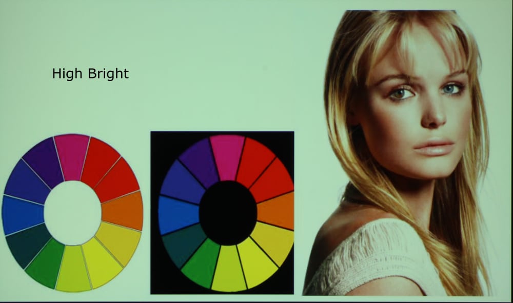
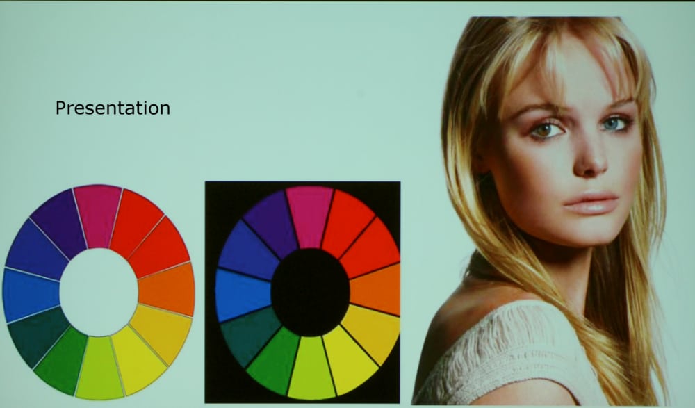
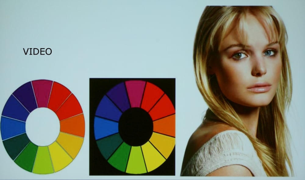
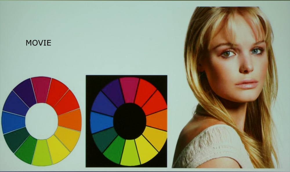
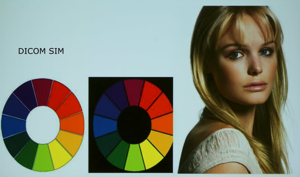
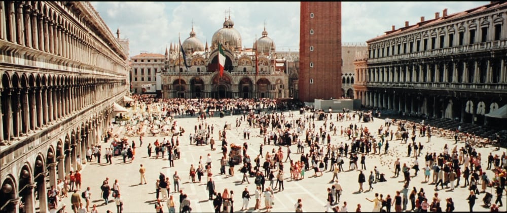
The NP-PA521U offers 7 preset picture modes. The photo gallery above shows our standard color wheel test image in each of these preset picture mode. I must note that colors shown in these photos only approximate what I saw on the screen and small color shifts in the projected images appear to be exaggerated in the screen shots shown in the photo gallery. Before going any further I must point out this is a 3LCD business class projector and virtually all such projectors have rather low native contrast ratios. As a general observation, applicable to all picture modes, this projector only offers a relatively low contrast ratio and moderately high black levels in the projected image. The result is blacks appear only as a moderately dark grey. More info on this topic can be found below.
The following is a brief summary for my observations of each of the available preset picture modes.
High Bright mode is certainly the brightest mode offered by this projector. The brighter parts of the image had a noticeable color shift with whites appearing with a green/yellow tint and the image was a s little washed out looking with several of the colors appearing a little dimmer that ideal.
Presentation mode was certainly better, overall, than the high bright mode in terms of picture accuracy. This is the 2nd brightest preset picture mode and the overall appearance had fair color balance, but tended to be on the cool side with a little overall blue tint.
Video mode was reasonably good, but with a cool overall appearance with a slightly blue tint, indicating a color temperature above the video standard 6500K. Colors were generally fairly accurate but at times the reds within the image seemed a little excessively bright compared to the other colors.
Movie mode (or cinema mode) offered in most projectors is generally the most accurate mode for viewing movies and that's the mode I used for evaluating the picture quality for viewing video. On this projector the movie preset picture mode did not have the most accurate out-of-the-box colors. Overall the image was too warm indicating a lower than the ideal 6500K color temperature and while the colors were generally fairly accurate in terms of saturation and hue, the reds were somewhat excessive as compared to blues. Also the image appeared somewhat too 'flat'. Even with my complaints the out-of-the-box picture quality was fair, but I found that with some user adjustments it could be improved considerably. See more on this in the section below on video picture quality.
Graphic mode had generally accurate color without with only a hint of excessive bright blues as compared to the other colors, but overall one of the better picture modes.
sRGB mode shared most of the same shortcomings with the movie preset mode. It was excessive warm indicating a fairly low color temperature and the reds within the image were excessive compared to blues. However, the image was not quite a 'flat' as in movie mode, indicating a higher gamma value, at least for the brighter area of the image.
DICOM SIM mode is intended for projecting black and white images using a unique gamma curve. I did not evaluate the NP-PA521U when projecting an appropriate test image, therefore cannot offer any meaningful review of its performance in the DICOM SIM preset picture mode.
[sam_pro id=1_113 codes="true"]
Video Picture Quality
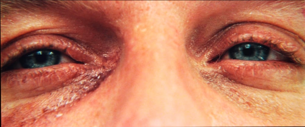
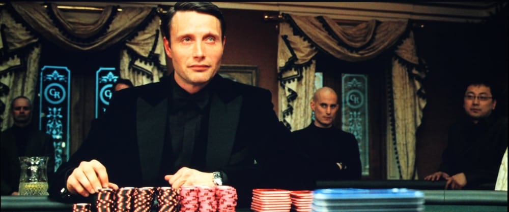
The gallery photos above were taken with the NP-PA321U operating in it's Movie Picture Mode and with the factory default settings, except had reduced the settings for both the Color adjustment and the Sharpness adjustment to -5 each. After watching portions of a couple of movies played from an attached Blu-ray Disc player, I decided the image could be improved with some more extensive picture adjustments. We do not normally calibrate business or classroom projector, but in this case I decided to do a quick calibration to improve the projected image. Below are pre-calibration and post-calibration results for grey scale:

Pre-calibration Grey Scale

Post-calibration Grey Scale
While achieving ideal grey scale tracking was not possible, it was substantially improved by the 'quick' calibration. The pre-calibration average color temperature was 6082K while the post-calibration color temperature was 6514K.
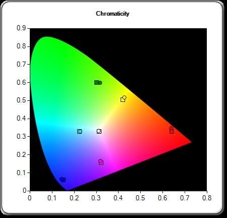
The pre and post calibration Color Gamut diagrams are shown below:

Pre-calibration Color Gamut

Post-calibration Color Gamut
While it was not possible to get the color points for the primary colors at the ideal position, the 'quick' calibration did improve color accuracy.
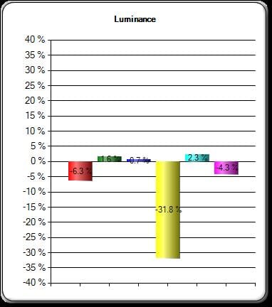
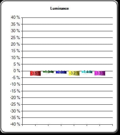
The above CIE diagrams for color gamut show only the color saturation and hue while the third parameter is Luminance (or how bright that color will appear and this needs to be balanced relative to the other colors. The two figures below show the pre-calibration and post-calibration results for luminance.

Pre-calibration Color Luminance

Post-calibration Color Luminance
As you can see from the above two figures the post-calibration results for color luminance, the calibration has eliminated all of the large errors seen in the pre-calibration results (especially for yellow).
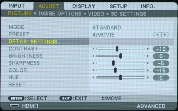
The 1st photo in the gallery above shows the top-level Picture Adjust menu with the item for Detailed Settings highlighted.
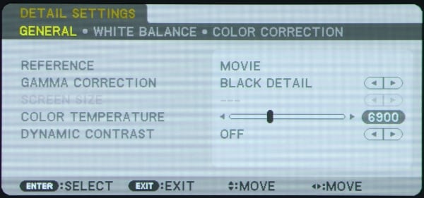
The 2nd gallery photo shows the 1st page of the Detailed Settings menu where I changed the Color Temperature setting from the default value of 6500K to a higher 6900K. I did this since the actual, measured, color temperature was about 400K lower than the setting in this menu.
The 3rd gallery photo shows the 2nd page of the Detail Settings menu where on this White Balance menu I adjusted the Contrast (gain) and Brightness (offset) for each of the Red, Blue and Green primary colors to produce the improved post-calibration grey scale results previously presented (above).
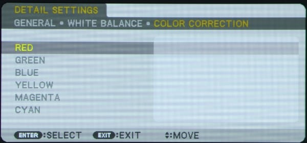
The 1st photo in the gallery above shows the 3rd page of the Detailed Settings menu which offers the adjustments for Color Correction.
The 2nd thru 7th gallery photos show the settings that I entered for Hue and Saturation for each of the 6 primary/secondary colors. These settings were used to produce the post-calibration color gamut results shown above.
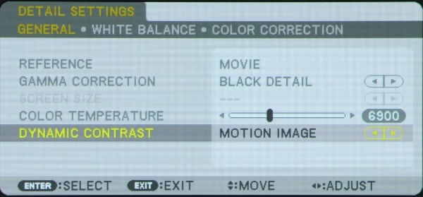
I performed the quick calibration with the Dynamic Contrast setting, on the first page the Detailed Settings menu, turned off. After completing the calibration I watched portions of a couple movies from a connected Blu-ray Disc player. While viewing the movies I tried turning the Dynamic Contrast to the "Motion Image" setting shown in the following photo.

I found even when set for "motion image" the action of this function was far too show to be on any real world benefit as it took a couple of seconds to dim the image after the video went to a fully black image. This is certainly consistent with what I have seen with most other business and education class projectors and is certainly not the equivalent to the dynamic iris feature found in most modern home theater class projectors.
[sam_pro id=1_113 codes="true"]
So what did the adjustments for the quick calibration achieve. The adjustments described above resulted in a video picture quality that I would rate as very good to excellent, for a business projector, while the out-of-box factory settings produced a less accurate image that I would rate as only fair to good in the movie picture mode. With calibration flesh tones look very natural and overall the colors looked accurate and no individual color appeared too bright nor too dark as compared to other colors. Overall a very natural looking picture. I must note that this is a relatively low contrast projector and as a result shadow details suffer in darker scenes and the images appear flatter with they would with higher contrast projectors when viewing the projected video in a very dark room, but there will much less of a difference when used in a room with moderate room lighting.
Text Image Quaity
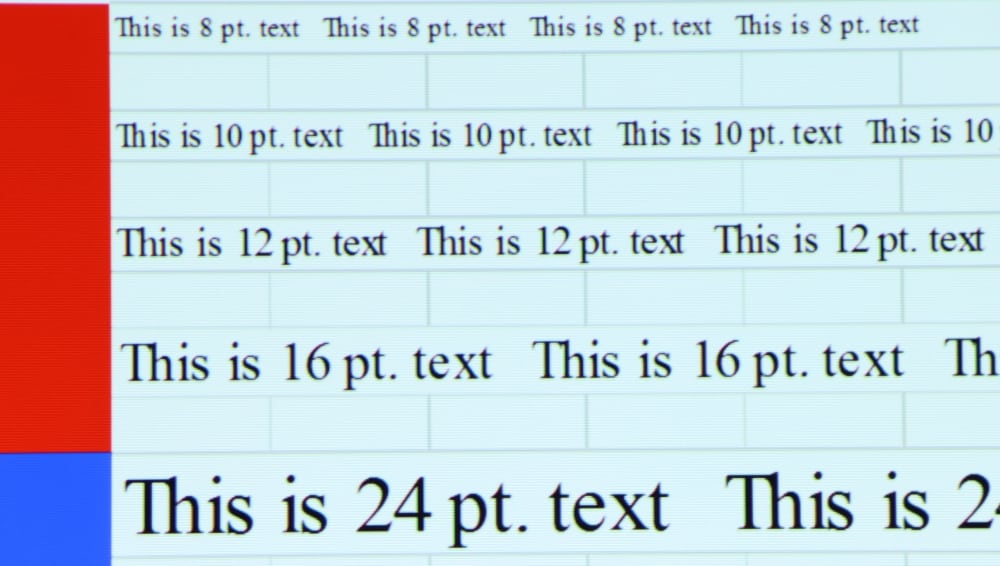
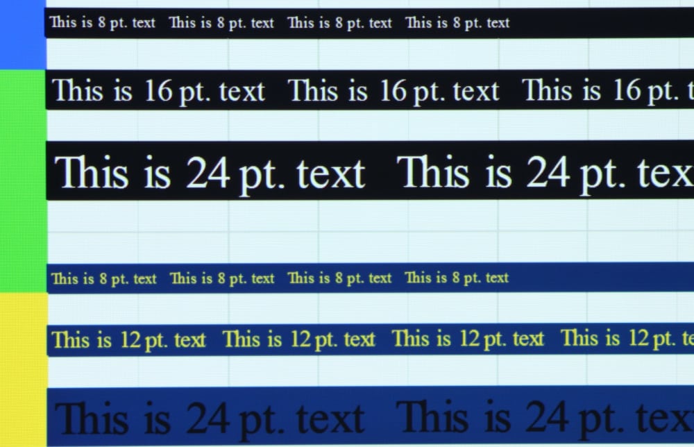
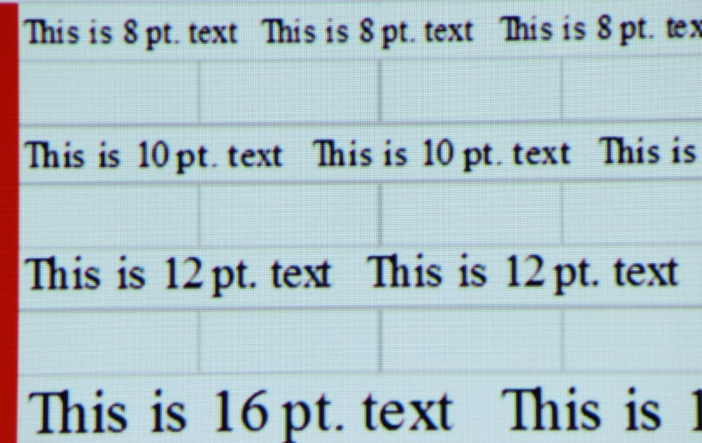
As can be seen in the gallery photos above, the NEC NP-PA521U does a very good job in clearly displaying text. I noted just a very little red-blue-green misconvergence when viewed up close to the screen, but his was not visible from normal viewing distance, or even from just a couple feet back from the screen. Convergence is never perfect with any projector using 3 display chips, be it a LCD, DLP or LCoS based projector. The recent 3LCD models that I have reviewed have, overall, been improved in this respect than the typical 3 chip projector from just a few years ago.
This model's high 1920 x 1200 resolution really helps with the displaying very sharp, highly legible text and presentation graphics, and is certainly superior to the results possible with the more common 1200 x 768 resolution business projectors.
I also tested the 1430Wi’s performance for scaling a 1440 x 900 resolution input signal up to the projector's native 1920 x 1200 resolution. A close-up of the upscaled text is shown in the photo below. This NEC model did an excellent job at upscaling the text image.

Image Contrast
For the typical business or classroom environment, with subdued to moderate room lighting conditions, the projector's contrast and black level limitations should not be real issue. This is because the ambient lighting tends to also light up the screen surface to the point that dark blacks within the projected image are simply not possible regardless of the contrast or black level performance of the projector. Given this situation, the relatively low contrast and elevated black levels found on 3LCD business projectors, including this NEC model, are generally not an issue for business or classroom projector customers. However, if the environment is really dark then business projectors using DLP or LCoS technology will generally offer darker blacks and better contrast images than 3LCD business projectors, including this NEC model.

