All of the JVC DLA-X70 screen image photos below are from either Blu-ray or HDTV source material. Screen images were taken projecting onto a Stewart Studiotek 130 screen. Comparison images (two projectors, side by side, were taken when projecting to a Carada Brilliant White screen, which is basically similar to the Studiotek).
Basically all the projectors we review, including this DLA-X70R, will look a lot better projecting on to your screen, (or even a white wall), than in these pictures. Although the images can reveal some things and support some points I make, they are mostly for "entertainment" for the following reasons:
These JVC DLA-X70R projector images come to you, through a Canon 60D dSLR camera, Photoshop software where we save for web, using massive image compression (which does shift color), browsers, your computer's graphic card, and even your monitor, all with their own color and contrast inaccuracies. There are color shifts, saturation differences, etc. Take them all, "with a grain (no, make that a kilo) of salt".
All that said, viewing a calibrated JVC X70 projector in a good room with decent content is a stunning experience.
"Out of the Box" Picture Quality
THX mode! Naturally I started out with THX for my first look at this JVC DLA-X70 projector. I'm used to THX modes not only looking pretty great, but also being very accurate.
Well, no doubt about it, THX mode does look great on the DLA-X70R projector, but it isn't all that accurate. In fact, Mike measured white (100 IRE) way up at 7623K, not at 6500 as desired. It is very similar to Stage, JVC's brightest mode. The picture looks fine but definitely a bit cool - a bit thin on reds but not drastically so. This kind of picture is very forgiving for sports viewing - a bit cooler, and brighter, than ideal movie viewing.
I recognized how far off the THX was, when I set up the Epson 5010 (calibrated) side by side. The difference in the whites was immediately very noticeable. Turns out, Film seems to be the best color "out of the box" but I really didn't spend any time with it - uncalibrated.
Mike basically used Film, with it's particularly good color gamut as the basis for his calibrated "Best" mode.
Check out our recommended settings for items like Brightness, Color, etc. on the Calibration page of this review.
 Click Image to Enlarge
To give you a good idea of the cool colors, in the THX mode, here are two side-by-sides with the Epson 5010, with the Epson on the right.
Note, in this setup, the JVC in "best" was brighter than the Epson's "best", so for the quickest way to adjust I simply put the JVC in low lamp mode, but that left it closer to, but a bit less bright than the Epson. Look at the white shirt on the waiter, you can see the less reds in the JVC. When viewing two images like this, the tendency is to think - the white is whiter on the JVC, but when viewing a movie, it's too blue, although one immediately tends to favor it at first look, over a warmer image.
In the second image, with Daniel Craig in reading in his Aston Martin note the leaves. The green on the JVC looks great, but it is a bit too green rich... By comparison, the Epson's greens have more red and yellow in them. Not so green intense. Watched separately, the Epson's greens are more natural, but then, remember - we're looking at THX on the JVC, right out of the box, (and cool) vs. a calibrated Epson nicely close to 6500K across the range, not up 1000K too high.
So, save THX or Stage for sports and other less critical viewing, if you are not having your projector calibrated (or using our settings). Try Film for movies, or better, plug in our full settings into User 1, to create something very close to a proper calibration.
Flesh Tones
I've watched a lot of content on this JVC. Upward of 40 hours so far, most of it in 2D. With Mike's calibrated User 1, skin tones look really good, but, by my take (and Mike's calibration) overall, the skin tones do not appear as natural as either the Sony VPL-95ES or the Runco LS5. Very close, and hardly a complaint, but I just don't think they are quite as excellent. Of course a different calibration could affect that, but I have to go with the cards that are dealt. And, over the years, and probably 100 calibrations, Mike's pretty consistent.
I should note that for normal movie viewing I found best, most natural viewing when Sharpness was kept to no more than 10, and Detail Enhancement at 15. Most images here were taken with those settings.
Black Levels and Shadow Detail
I mentioned on the first page of this review that the JVC X70R produces excellent black levels. This is important. The black level performance of the X70R may well be its single greatest achievement, even though the more expensive JVC's starting at over twice the price are even better. With the X70R, even on the darkest scenes, our side by side viewing with the Epson showed that at its best the Epson could barely match the JVC and on most scenes, the JVC X70R offers a slight, but distinct advantage.
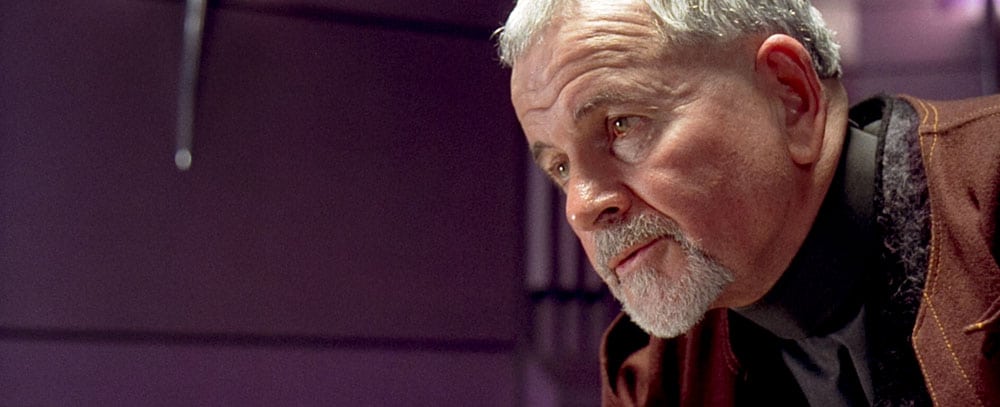
For black level fanatics such as myself, this partially explains why I happen to own a JVC projector. Below you will find our usual images including the train scene from James Bond’s Casino Royale, taken at night (or what looks to be night), and also the starship image from the Fifth Element. These are two good examples for evaluating black level performance and dark shadow detail.
Note, that this JVC does not exhibit the blue caste in the darkest areas, that we reported seeing on the JVC RS45.
Let's start with a a direct comparison between the JVC DLA-X70R (on the left) and the Epson 5010 (on the right). As many of you know, the Epson offers exceptional black level performance for an under $3000 projector. It can't match this JVC, but it is, at least, a serious competitor in this regard.
 Click Image to Enlarge
The darkest blacks are a touch blacker on the JVC X70R, and the "bright" edges of the shrubs and trees are a bit whiter - brighter! There's more dynamic range across the image with the JVC, a good thing. That these images look this close, is a great testament to the Epson, considering the JVC's roughly 3 times the price, and has the best blacks under $10,000.
Close inspection of the large version of this side by side train image doesn't really reveal more dark detail with the JVC, nor the Epson. Thanks to the greater dynamic range, though, he JVC's image has more pop.
Overall the JVC image does look a touch more lively. The impressive thing is that even the Epson is sufficiently good, that it doesn't look at all flat in this scene compared to the JVC, despite the JVC having the best blacks around, period. In other words, for a dark scene, the Epson really does pop rather nicely, it's just the JVC beats it! Kudos for JVC, still proud owner of the best blacks in projector land.

