I do about twice as many home theater projector reviews as business projectors, and its been a few months since my last batch of business projectors, so it takes a bit of effort to shift gears, and focus on what matters most for presenters.
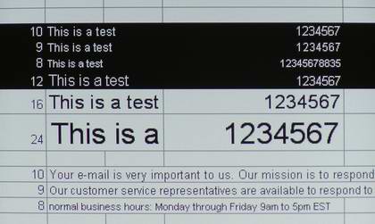
Image quality of the IN34, overall is very good. Projecting a standard 1024x768 XGA signal from my computer, produces results on the screen that were both sharp, and bright. As you can see from the image immediately below even very small type is nice and clear, and extremely readable. The type sizes are marked in the left column and you are seeing sizes down to 8 points, far smaller than anyone would normally project. (Spreadsheets and emails are typically 10 to 12 points, to give you an idea, and Powerpoint type presentations are usually in type sizes from 18 - 60 points, with sizes less than 18 points rarely found except on text supporting charts.
Of course today, many people have laptops or desktops that are running resolutions higher than standard XGA. This next image shows the IN34's compression capabilities, with a higher resolution source.
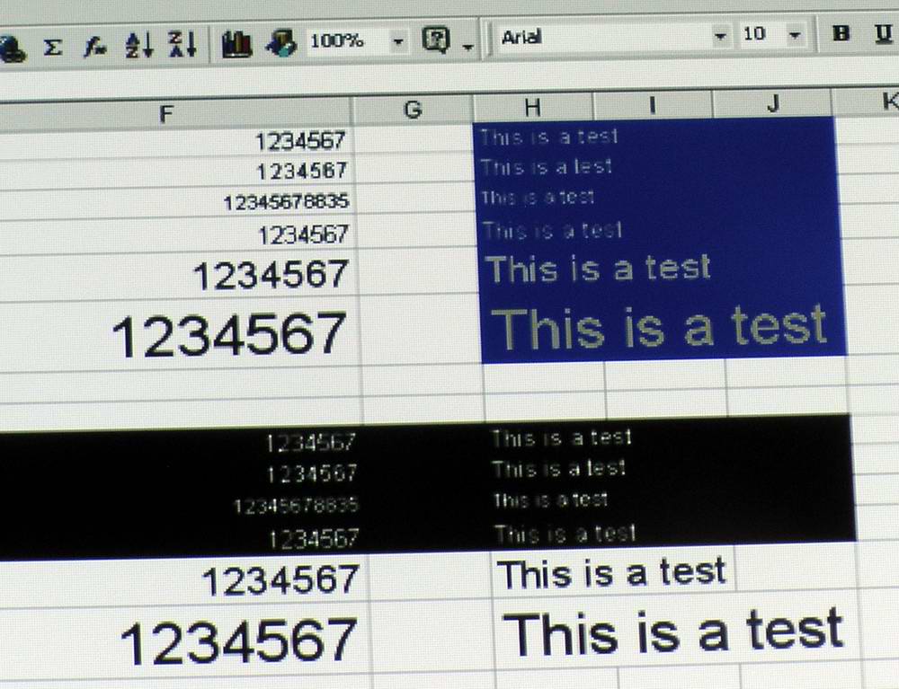
To further challenge it, you are looking a yellow text on blue, and white text on black. Both are far more challenging for a projector than black text on white or gray. You can click on this image for an enlarged version.
As you can see in the larger version, the smaller type, - under 10 points is getting pretty ugly on the yellow on blue test, and although better on the white on black, there is still some breakup.
That said, the important thing to remember, is that under 10 point type is basically impractical in presentations. So, where the IN34 does poorly in this test, is in projecting compressed very small type, something that almost no one ever does. You'll not that the larger type sizes are perfectly readable.
If you are in a conference room and put up an image with a various type sizes, remember, only the people in the very front are going to be able to read 8 - 10 point type, no matter how good the projector displays it. eople at the back of the conferernce table are just too far away to read 8 point type without binoculars! So, this test does show the limitations (the feed, BTW, was a 1280x800 feed from my Dell laptop, with the IN34 doing the compression).
The bottom line, therefore is that the compression capabilities of the InFocus IN34 are just fine, and not an issue, for normal presentations.
For evaluation purposes I filled most of my 106" Carada screen a white surface with slight gain. Since my screen is 16:9, and I am filling it with a 4:3 aspect image, the actual size of the screen that I used was the equivalent of an 80" diagonal 4:3 screen, a bit larger than found in the average conference room.
On that screen size, the picture was more than bright enough on standard data and graphics.
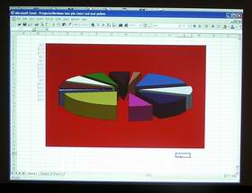
Color handling is the InFocus IN34 projector's weak spot. In that regard, the IN34 is very typical of most - but not all business DLP projectors. Due to the general nature of things (which i won't get into here, but is covered in our LCD vs. DLP projector article), most DLP projectors are weak on reds and yellows. Bright, pure reds, tend to come out more dark, wine colored, and bright yellows, instead, tend to be more mustardy looking with a greenish tinge to them. Generally, if color accuracy on data (in brighest modes) is very important to you, then you will probably be better served by choosing an LCD projector than a typical DLP model, although there are some DLP projectors that rival the LCD's in handling of Red and Yellow.
The background red should be that bright "fire engine" type pure red, and not that dark. The slice of the pie, front left is supposed to be bright yellow on the top of the slice. Again, this is very typical of DLP portable projectors!
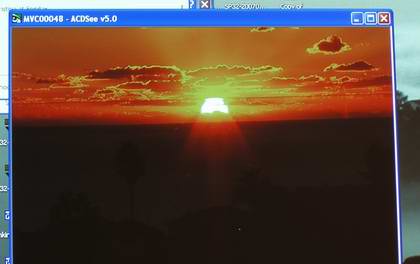
When feeding a photo from my computer, the same color issues continue in the brightest mode (Presentation), as shown here by this sunset image. Of course I couldn't find a photo, that would highlight the red and yellow colors any better than this one, so it makes the InFocus IN34 look its absolute worst. Once again, the reds aren't bright, and the yellows around the sun have that murky, greenish tint.
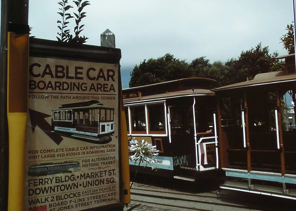
One more image from a standard photo, and the IN34's Presentation preset mode: This one of cable cars simply looks dull, as the red component in the cable cars tends to be lost, giving them a flat, brown look to them: The posts on the signs are supposed to be yellow and a darkish red.
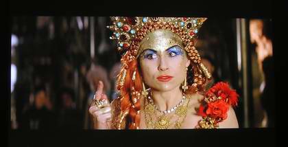
The really good news is that the IN34 is capable of far more accurate color when needed. All you have to do is kick the IN34 into one of its video presets. The brightness drops considerably, but the colors now are far, far better. I grabbed a video frame from Phantom of the Opera (shown below), and as you can see, things are looking pretty natural. The same is true if you are presenting data, in that mode. The downside, is a loss of more than 50% of brightness. Even so, that has the InFocus still putting out close to 600 lumens, which is more than adequate on a 60" or 72" diagonal screen with moderate lighting.

