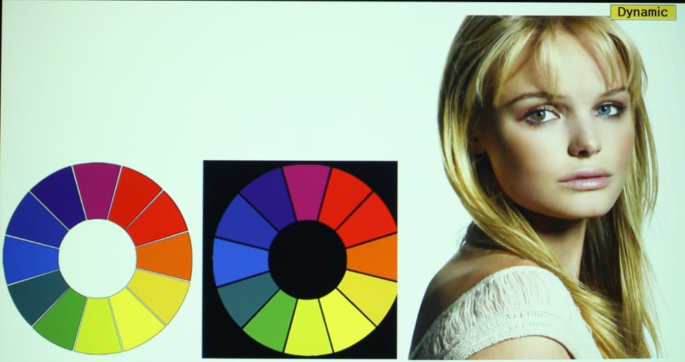
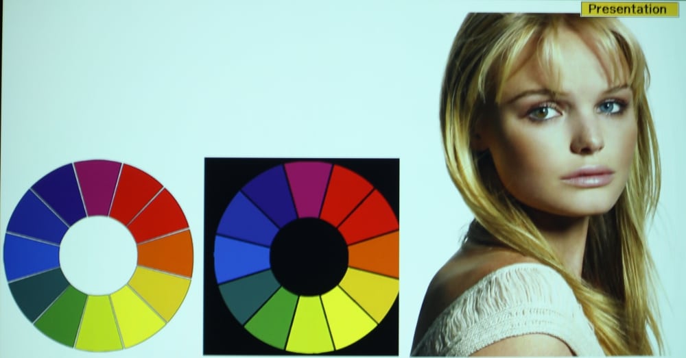
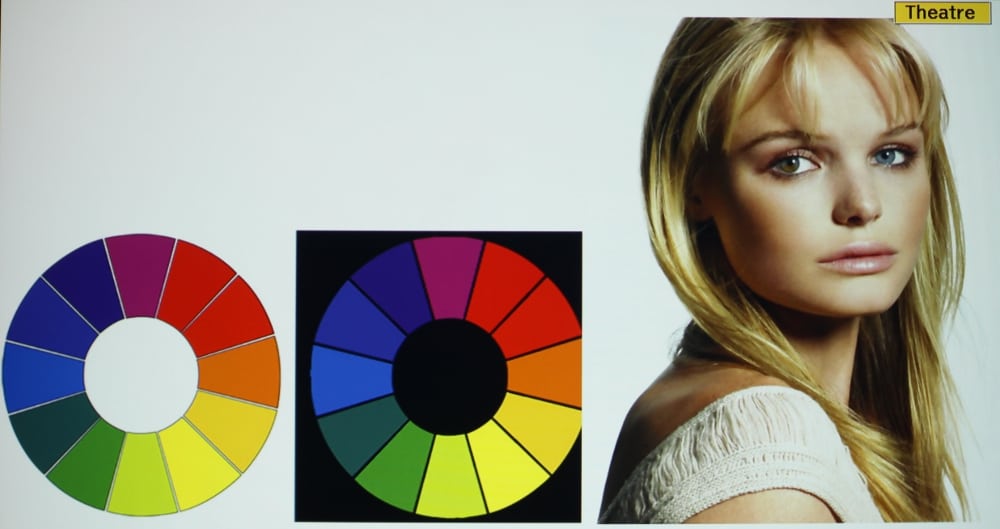
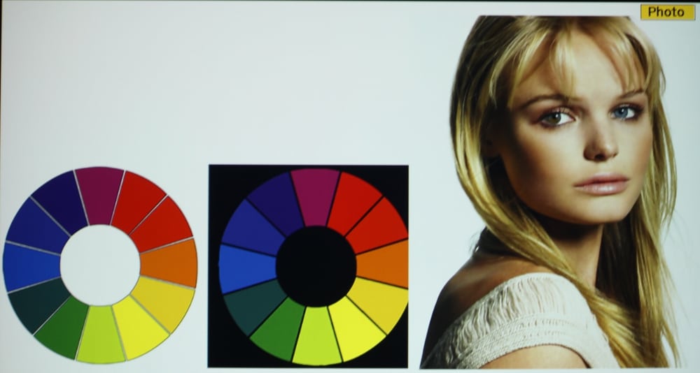
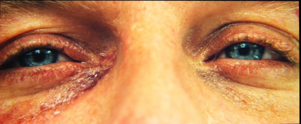
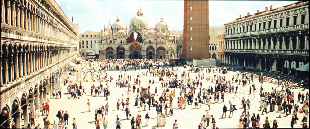
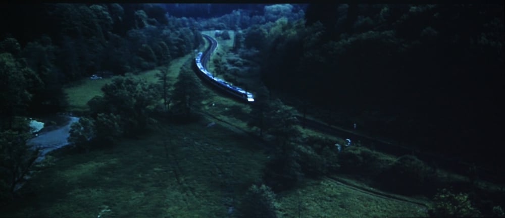
The Epson VS335 displays presentation materials with very clear text while both presentations and video are generally displayed with rich, well saturated colors. For my initial evaluation of the VS335, I used the factory default settings for each picture mode. As a general observation, applicable to all picture modes, this projector only offers a relatively low contrast ratio and moderately high black levels in the projected image. The result is blacks appear only as a moderately dark grey. This is not unusual this class of LCD projector. Finally, certain features shown in the projector's menus are only offered in specific color modes. For example, the Auto Iris (i.e., dynamic iris) can only be used when the projector is operated in Dynamic or Theater modes.
In the brightest mode (called “Dynamic”) the greys and whites had an overall green tint. The greens also were shifted toward yellow. In this mode the reds were too dark as compared especially to the greens and overall the image did not have a good color balance. Frequently the brightest mode on a projector has such poor quality that it’s of little value except in the rare cases where every last bit of light output is needed to overcome room lighting. In the case of the VS335, its brightest mode could prove useful for presentations where room lighting cannot be easily controlled and color accuracy is not important. However, there are some still fairly bright color modes available on this projector that offer more accurate color.
The VS335W offers a “Presentation” picture mode that is approximately 80% as bright as the “Dynamic” mode and offers somewhat more accurate colors. Images in “Presentation” mode have an overall blue-green tint (but less pronounced tint as compared to Dynamic mode) and the reds are darker than the greens and blues. The greens in this mode continued to show some shift toward yellow. Overall colors appear more accurate in Presentation mode than they do in Dynamic mode, but overall the image appears to have a too "Cool" color temperature.
The “Theater” color mode provides a reasonably good overall color balance with the out-of-the-box settings. While the green colors tends to be shifted a little toward yellow, the remaining colors appeared reasonably accurate. Overall the image appears “warmer” than in Dynamic and Presentation modes and is well balanced from the very dark shades thru mid and bright shades. When viewing video in “Theater” mode the projected image appeared just slightly too warm, especially in the brighter picture elements. Blues appear just a little too dark as compared to reds and greens. This indicated the actual color temperature with the factory default settings was actually a little under the 6500K recommended for displaying video.
The “Photo” mode also provides good colors with the out-of-the-box settings. Images displayed in Photo mode have well balanced color and perhaps just a little on the “warm” side. Blues appear just a little too dark as compared to reds and greens. Photo mode is only available with when the HDMI input signal is in RGB signal format (i.e., Photo mode is not available when the HDMI signal is in component YCbCr format).
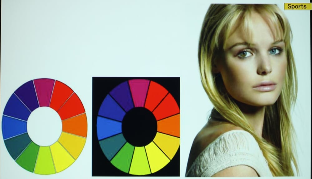
The “Sports” mode is intended for viewing sports programs in a bright room and this mode provides the second most light output from the projector (only less than the Dynamic mode). Sports mode has a overall cool appearance with some blue-green tint to the image for dark through moderately bright greys, with the reds being a little too dark. For bright greys and whites the overall color balance is somewhat better than for the dark and mid-shades. The greens where shifted toward yellow to an extent similar to what was seen in most of the other modes. While less accurate than “Theater” and “Photo” modes, ”Sports” mode overall provided better color balance than the Dynamic or Presentation modes while offering a very bright image sufficient for use in rooms with moderate ambient lighting. The Sports mode is only available when an HDMI input signal is in component YCbCr format and not RGB format.
The “sRGB” mode is intended for use with a computer as the input signal source. I found this color mode to project an image a little on the “warm” side, tending to have a darker blues than reds and greens. This was a little more noticeable with brighter shades of greys and whites. As with the other modes, the greens showed some shift toward yellow. Overall the color accuracy for “sRGB” mode was more accurate than with “Dynamic” and “Presentation” modes while offering a color accuracy closer to “Theater” and “Photo” modes.
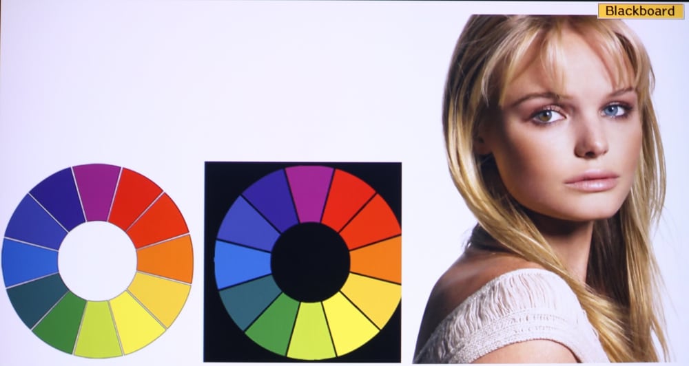
“Blackboard” mode had rather poor colors when viewed on a white screen, but that is not the intended projection surface for this color mode. When viewed on a white surface the image had a strong magenta tone indicating a low green output as compared to red and blue. Since I did not have the intended surface to project the image onto, I could not properly evaluate how the colors would appear for the intended application of this mode.
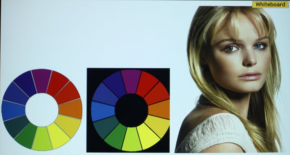
“Whiteboard” mode is intended for projection onto a classroom whiteboard, instead of a conventional projection screen. This mode has fairly well balanced colors, especially for the brighter shades of greys and whites. Overall the Whiteboard mode appeared to be a little on the “cool” side, with the blues and greens a little brighter than the reds. Overall color balance was good.
Readability
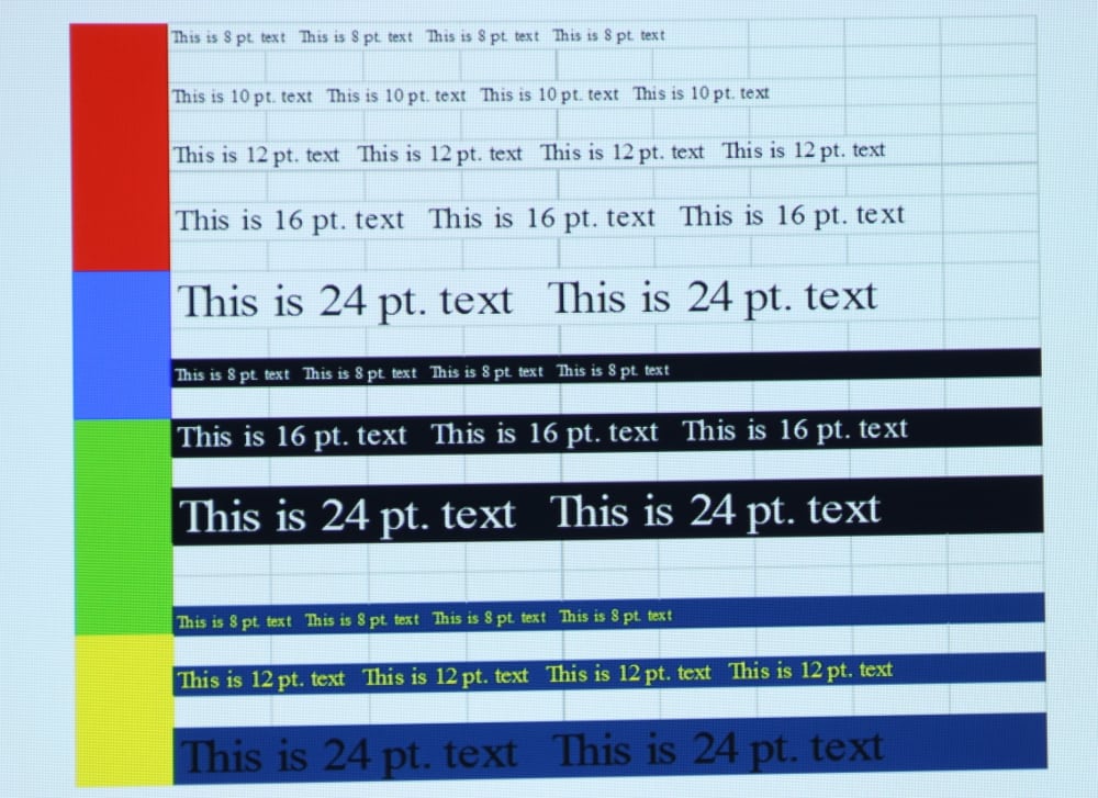
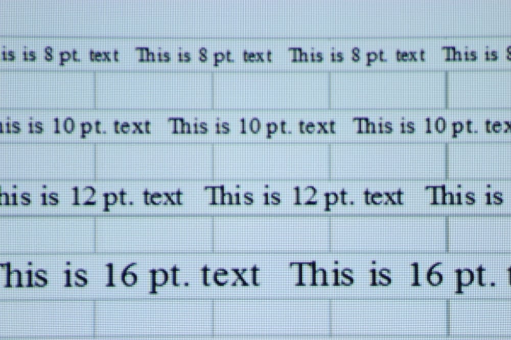
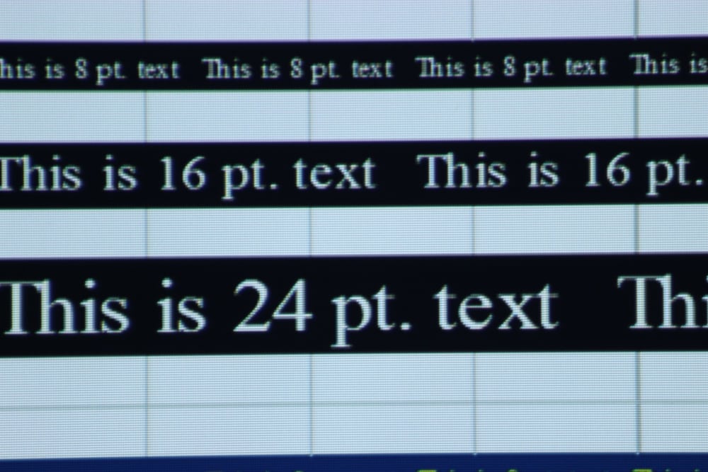
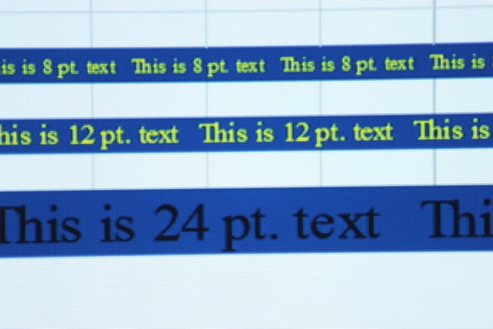
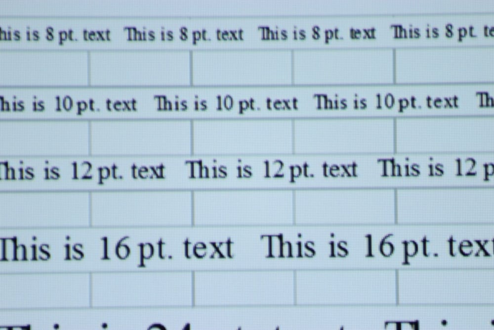
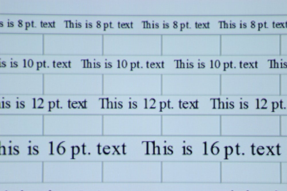
The VS335W′s image resolution and text clarity is excellent and limited only by its native 1280 x 800 resolution. Even 8-point text was easy to read in both black text on a white background and with white text on a black background. When my attached laptop PC was set to the projector’s native WXGA (1280 x 800) resolution (as shown in the photos above) the text readability was excellent. The was no noticeable color fringing on the text from a normal viewing distance and very little color fringing even when viewed up close. This is very good performance for a LCD projector and even better than a few of the DLP projectors that I have reviewed that exhibited a significant chromatic aberration resulting in color fringing. I was able to get sharp focus over the entire image.
After evaluating the readability of text with an input signal at the projector’s native WXGA resolution (as shown in the photos above – click above for larger image), I evaluated the ability of the projector to scale higher resolution input images down to the projector’s native resolution. To test this I increased the resolution of the input signal first to 1440 x 900 resolution then to 1920 x 1080 resolution. I found the scaling performance of the VS335 to be excellent as can be seen in the 2 photos below (click on these for a larger image) when using the above 2 higher resolutions for the input image.

Text with 1440 x 900 Input

Text with 1920 x 1080 Input

