Color and Picture Quality
When setting up the PowerLite W29 on the test bench, I used its default settings and started by cycling through the five projection modes. Unfortunately, you can’t make up your own mode to suit your environmental conditions by customizing the system’s settings.
While the projector has an up to 10,000:1 contrast ratio specification, it looks significantly lower. That’s due to fairly high black levels that are visible as dark gray tones rather than dead black. While this might preclude it from being used in a home theater, the PowerLite W29’s overall brightness suits use in the classroom fine.
The projector’s Dynamic mode puts out the highest light level of the five modes. It delivers 3,050 lumens to the screen, just above its 3,000 lumen spec. As is usually the case with a projector’s brightest mode, the extra light is at the expense of color balance, with an overall green cast to the imaging. The mode’s greens looked more like grass than a stronger forest green. Reds and blues were solid and vibrant but a little on the dark side. Flesh tones were actually quite garish, making portraits and otherwise serious movies look like zombie films.
The PowerLite W29’s Dynamic mode was actually surprisingly good for presentations where the images will be composed of blocks of color rather than realistic photos or videos and realism is second to blasting an image onto the screen. It’s the one to choose to use for a room where you can’t control the lighting or that has a lot of light to compete with the projected image. In other words, use Dynamic mode for a large classroom or lecture hall with the lights on and blinds up.
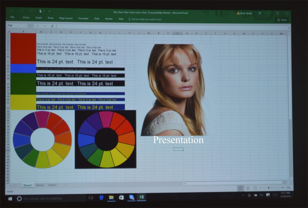
Surprisingly, the Presentation mode drops the PowerLite W29’s light output only slightly to 3,030 lumens but delivers much better color balance. Still, the images it creates are overly blue, but more than acceptable for presentations and lessons.
If you’re going to be projecting movies, the PowerLite W29’s Theater mode is the best of the bunch but at a cost of much lower light levels. Its illumination level drops to 1,760 lumens, but the overall feel was warmer with much more (perhaps too much) red mixed in. This mode works the best for brightly lit scenes where flesh tones looked more realistic and sometimes obscures subtle shading and shadows. Unfortunately, there was a slight pink cast to the screen.
You can also use the similar sRGB mode, which is meant to be used with computer sources. It was similar to the PowerLite W29’s Theater mode in overall impression, but without the pink tinge. Its flesh tones were quite believable and the overall balance was pleasing to the eye. On the downside, this mode can deliver 1,730 lumens of light.
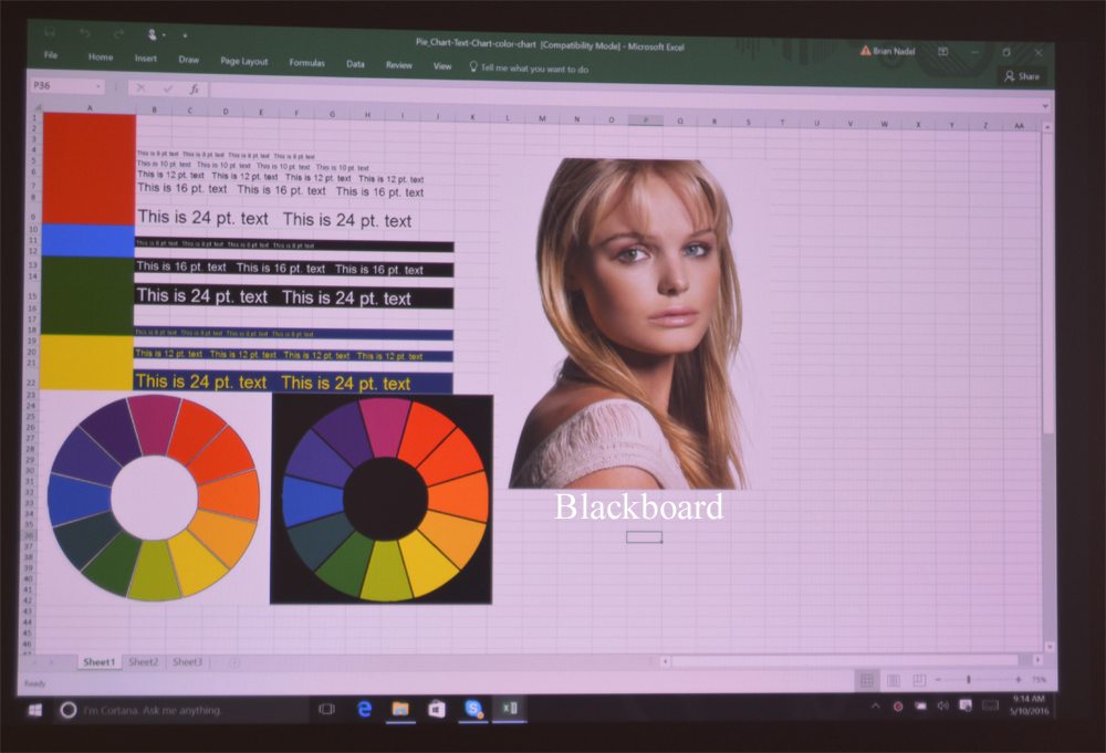
The W29’s Blackboard mode is custom-made for schools with classrooms that have traditional chalkboards rather than pull-down screens or white marker boards. As its name implies, it’s meant to be used on a blackboard and everything looked red here. It lacked many green tones and delivers 1,450 lumens of light, less than half that of the Dynamic mode. On a black surface, it looked OK, but is really for presentation graphics and the occasional map and not showing realistic photos or video. The bonus is that the teacher or a student can write on the images using chalk, although white works the best.
Text Readability

Even from far away, the PowerLite W29’s ability to render clear and sharp text was good, considering its 1,280 by 800 resolution. I was able to easily read 8-point type, regardless of whether it was white on black, black on white or yellow on a blue background. It lacked any annoying fringing at the edge between dark and light elements, but the edge where white met black was subject to moderate blooming.
Video Performance

While it would pale in comparison to a home theater projector, the PowerLite W29 does surprisingly well for showing video. I watched the opening and closing sequences from “2001: a Space Odyssey” to examine its high and low points in Theater mode. The projector’s sharp focus could be seen with the ability to display lots of details, such as cracks and crevices in the rocks and water rippling on the pond shown in the movie’s initial monkey scenes. The imposing black obelisk showed up sharp and true.

Its color balance was quite nice with realistic tones, particularly the warm sunrise and sunset scenes. In the penultimate scene of flying through an array of colors, the scenes looked oversaturated, but that could just be the effect the film was aiming at.


