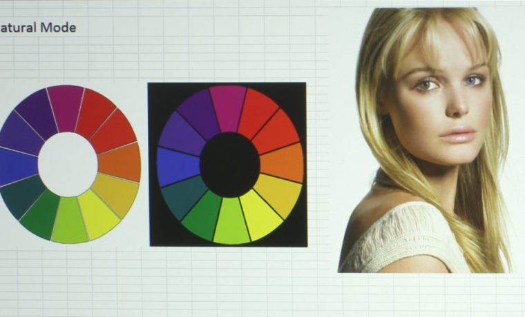
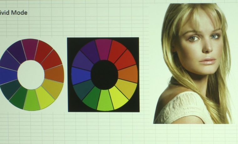
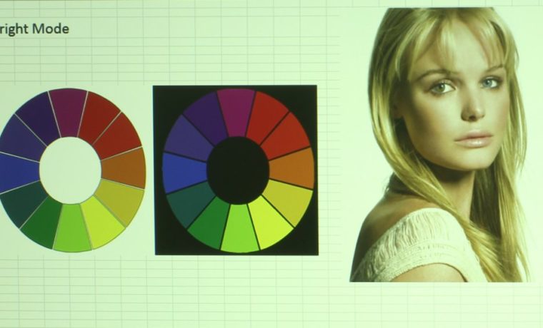
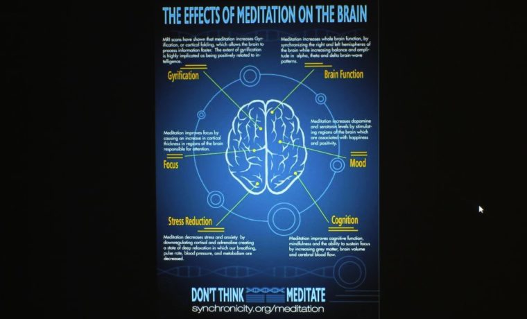
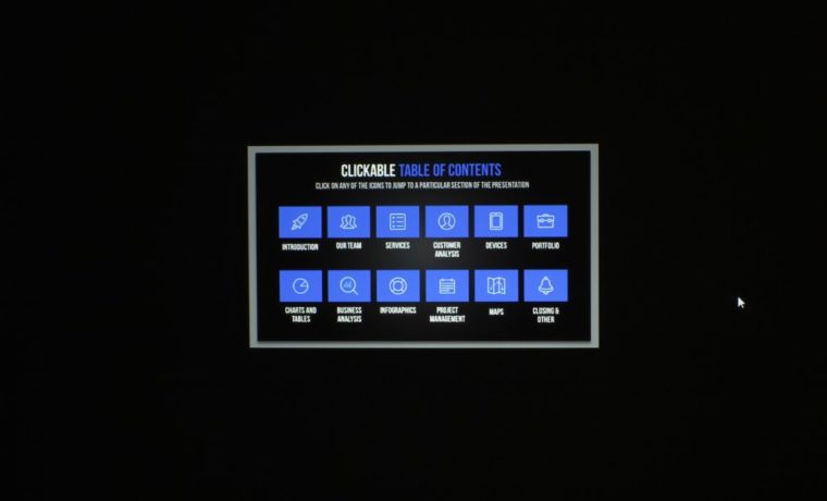
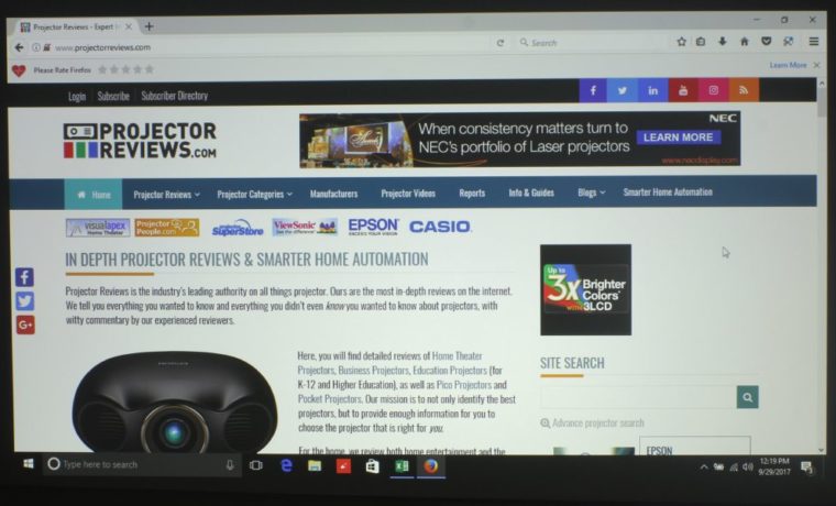
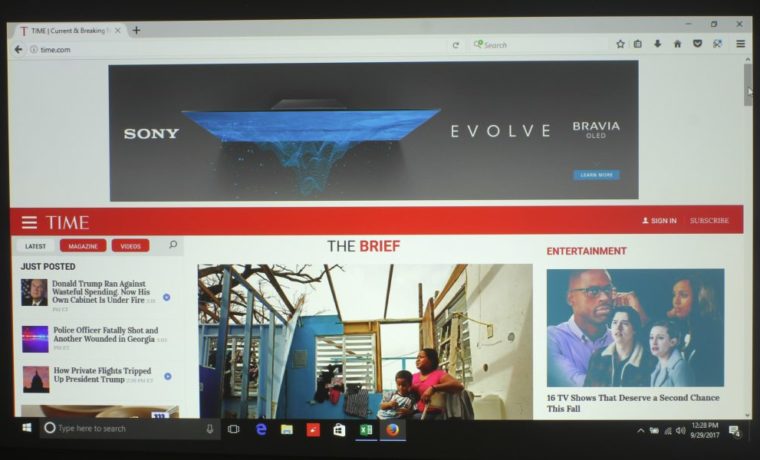
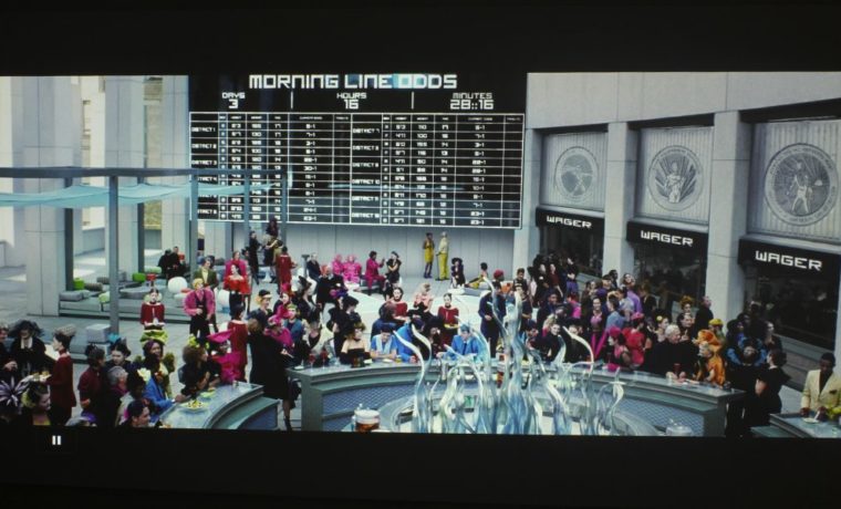
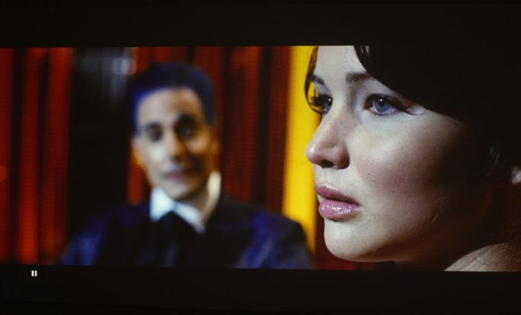
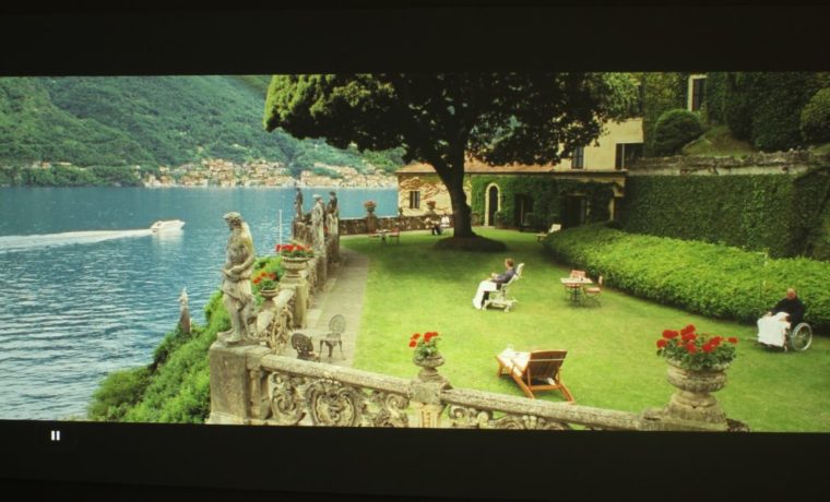
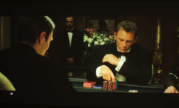
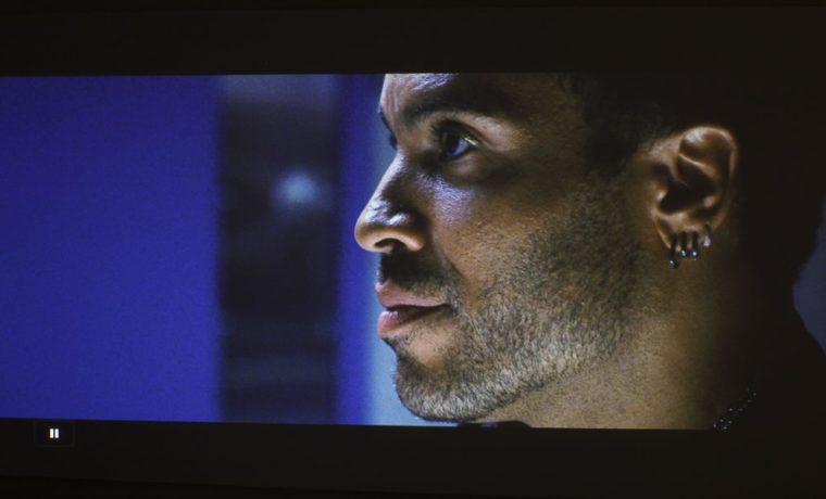
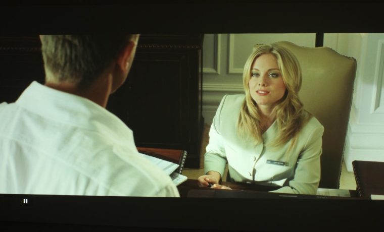
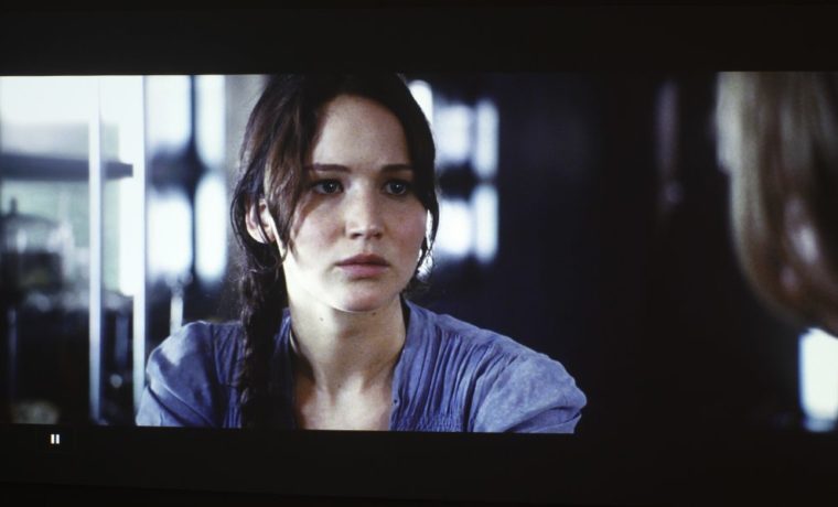
Overall, I was not particularly impressed by the Casio XJ-L8300HN’s color modes. There are only three: Bright, Vivid, and Natural. They range from having a ghastly green caste (typical of brightness modes of projectors), to a slight green caste, to pretty good. Natural Mode, in my opinion, is the best one to be used. Some colors are a bit off, with slightly murky reds and mustard yellows (common amongst DLPs), but I can live with that. Need more brightness, Vivid is pretty good, and can be tweaked for even better color.
I noticed this when I saw the red Netflix logo and its profile graphics (mine is yellow), and with my avatar on the Playstation menu. Now, you’re not likely to be using either, that’s just how I knew immediately that the mode wasn’t entirely true to color since I’m a serial user of both.
That said, I did like Natural Mode for everything – presentations, infographics, Journey to Space, and other films. I didn’t bother with the other modes because they’re like your typical brightest modes – very strong greens and yellows, as you can see in image slider above. That darkish red (instead of bright pure red) and mustard yellow (instead of yellow) problem I mentioned earlier? I barely noticed it when viewing content – mostly on images like our test image with color pie chart.

