COLOR AND PICTURE QUALITY
Rated at a 3,000 to 1 contrast ratio, the projector showed sharp delineation between light and dark and excellent grayscale rendering. Grays were generally well-defined and lacked any visible dithering. To its credit, unlike many projectors, grayscale images were actually gray and not pink.
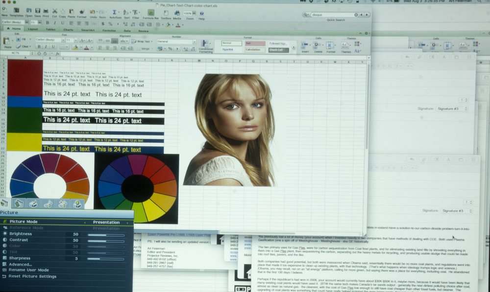
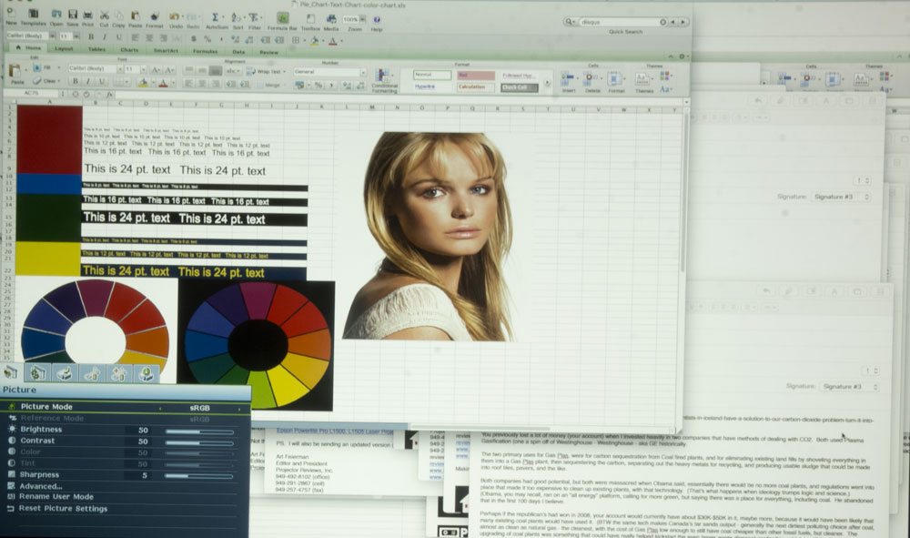
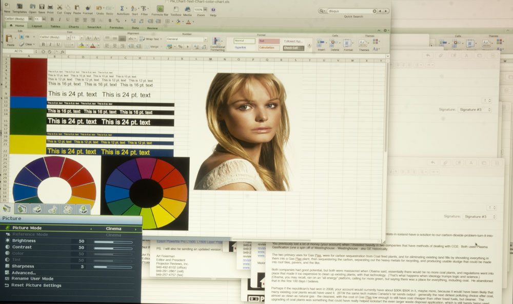
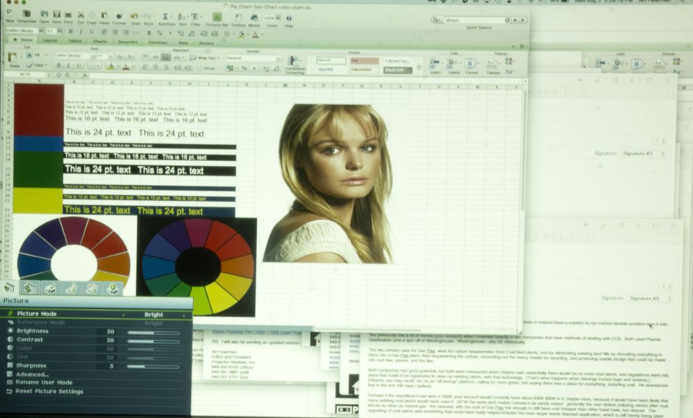
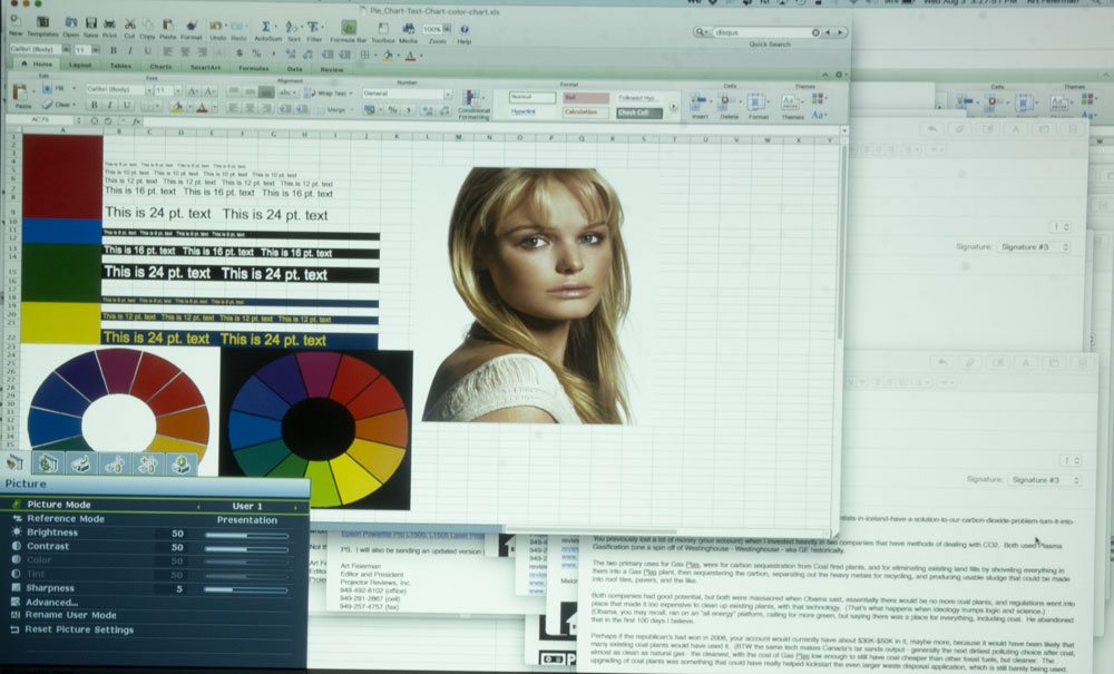
The test images above are displayed in this order: Presentation, sRGB, Cinema, Bright, and User 1. (User 1 and 2 default to the same as Presentation mode, but you can select any other preset mode as the default for he User modes.
For a projector with business pretensions, the SU931 showed unexpectedly strong black levels. There was little difference between the edge of a projected black image and an adjacent non-projected part of the screen.
In the projector’s Bright mode, it more than lived up to its 6,000 lumen brightness rating with a measured 6,090 lumens, although the right side was about 10-percent brighter than the left. This level of illumination should be able to stand up to room lights or open shades, but comes at the expense of color fidelity with an overly warm appearance.
Flesh tones look surprisingly good (for a "brightest" mode), but this mode should really be used primarily for presentations with lively individual colors. Overall, there’s too much green in the mix. Plus, the top of the screen was noticeably warmer than the bottom.
As is the case with many DLP-based projectors, the SU931’s yellows were duller across the board and more mustardy that I like to see. You can try using the Brilliant Color option in the Picture portion of the Menu, which can punch up each color significantly.
While the Presentation mode’s output drops to 4,495 lumens, it’s worth the loss because the color balance, while not perfect, is more uniform. It has an overall blueish look that adds up to a cold look. There’s significant blooming on images, though.
The SU931’s output drops to 4,350 in sRGB mode, but its balance is the best of the bunch. A little too much warmth for my tastes, it’s the best compromise for good realistic flesh tones. Some blooming is still present.
TEXT READBILITY
With exceptionally uniform focus from corner to corner, textual items projected by the SU931’s text was very readable to 8-point type (at normal WXGA size from my laptop). Of course at WUXGA resolution every character is barely 45% the size of WXGA, so the same test image occupies barely half the same area of the screen. 8 point type there isn't readable, but you would probably have to be 3-4 feet from a 100" screen to read it even if it was razor sharp, since the type would be so small.
The BenQ SU931 worked just as well for white on black, black ion white or yellow on blue. Characters were well formed and sharp with little to no rainbowing around the edges.

Close-up of text, projected at a WXGA size (1280x800) 8 point type is readable, 10 and 12, nice and sharp

Close-up of type at a WUXGA resolution 1920x1200. Everything is much smaller on the screen 8 point type is 2/3 the size as when projecting at 1280x800. Still 8 point type is not quite readable and 10 and 12 point type, much better.
VIDEO PERFORMANCE
The SU931 is a business projector and will generally be relegated to displaying presentations, spreadsheets, product images, Web pages and the like. It will need, on occasion, to faithfully show video, like video clip of how a factory process works, a video conference or the company’s latest Web or TV commercial. It does this surprisingly well with no artifacting, missing frames or stuttering. Its sound synchronization was excellent across a range of material.
For instance, in the beginning of “2001: a Space Odyssey,” the SU931 in sRGB mode did a workman-like job of showing details that some projectors lose in the shadows. You can see broken rocks and textures that others miss. and water rippling on the pond shown in the movie’s initial monkey scenes. The imposing black obelisk showed up sharp without any jagged lines or image jumping. Its ability to render the rippling water on the pond scene is very good.

From 2001 A Space Odyssey. (unfortunately this image is a bit out of focus).
The sunrise and sunset scenes are overly warm but generally the projector’s ability to render realistic colors is impressive considering its audience and price. It all comes together near the end when the space ship is flying through an array of bright colors. Here, the SU931 shows off with well saturated excellent red, blues and oranges.
Overall, skin tones are faithfully rendered with some unexpected details, like wrinkles or stubble visible on close inspection. Unfortunately, the SU931 lacks a dynamic iris. It manages to show very nice black levels that were very close to adjacent areas that were outside of the projection zone.

While designed for business use, the SU931 still delivers nicely saturated colors.
SOUND QUALITY
As noted earlier, the SU931’s internal sound system is unexpectedly good with a pair of side-firing 10-watt speakers. It gets loud enough for a mid-sized conference room or small auditorium. On spoken word programming, it was clear and static free, while music and movie soundtracks came through with just enough mid-range tones to sound rich and vivid.

With a pair of side-firing speakers, the SU931 sounds surprisingly good.

