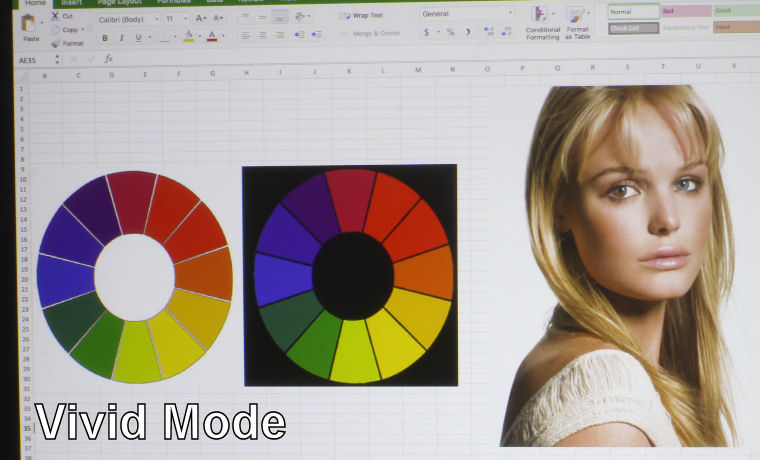
BenQ LU950 Color Modes: Vivid Mode

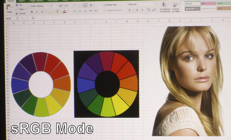
BenQ LU950 Color Modes: sRGB Mode

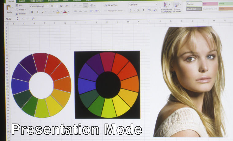
BenQ LU950 Color Modes: Presentation Mode

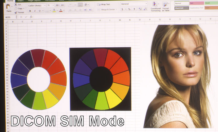
BenQ LU950 Color Modes: DICOM SIM Mode

BenQ LU950 Color Modes: Bright Mode
❮
❯
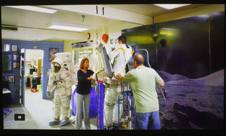
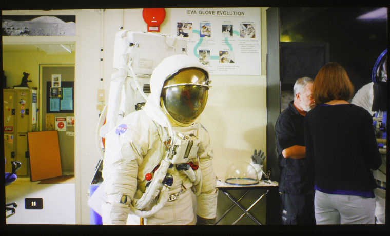
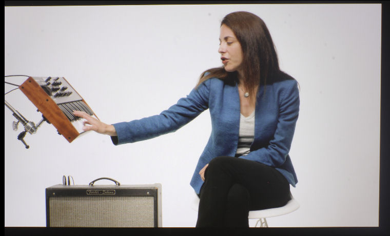
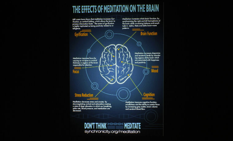
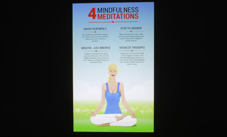
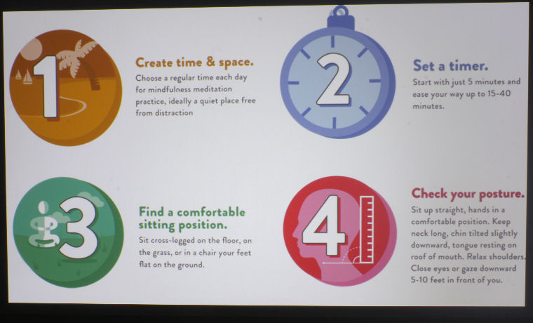
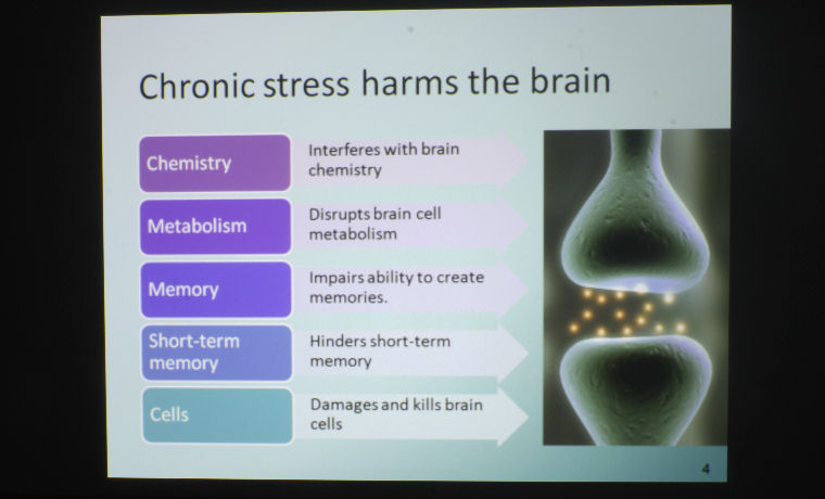
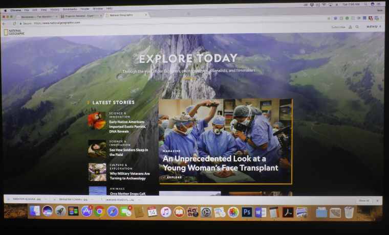
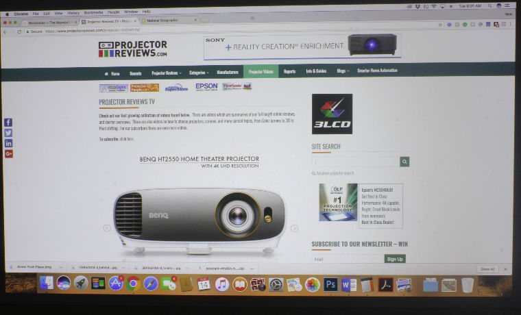
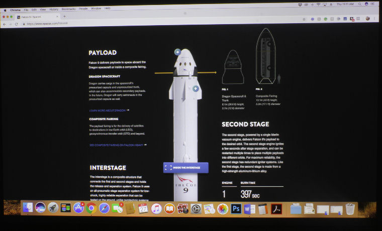
I love the color on this projector! I’m usually, truly not a fan of DLP projectors for a lot of reasons, one big one being the color. DLPs tend to have wine reds and mustard yellows rather than vibrant, true-to-color reds and yellows. 3LCDs perform much better in that regard. However, things are looking pretty good when it comes to the BenQ LU950’s color handling! I think the RGBY color wheel, in this case, truly does improve on the color. Everything looks awesome, but I do have a few comments before I get into the specifics of each mode.
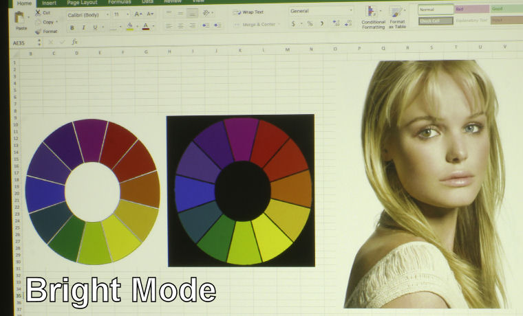
Across the board, reds have a tendency to lean toward orange. With some tweaking of the colors via the menu, you should be able to improve on that a bit, but it’s something I only noticed when looking at our test image of the color wheel. As you can see from the photos in the slider above, most modes do a good job on skin tones, and that orangey-red is likely only going to be noticed when looking at a color that you know is supposed to be a true red.
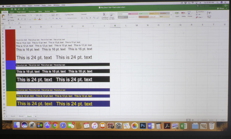
Let’s start with Bright Mode, which is – you guessed it – the projector’s brightest mode. Its color is typical of a brightest mode – strong greens and yellows. We call these your “break glass in case of emergency” modes. In the case of the LU950, you’ll likely never have to use this mode because all of the other “best” modes are bright enough to combat some serious ambient light, as you will see on the next page. Presentation Mode had some pretty great color, and though it is on the cooler side, it does a fine job on skin tones. I did notice that on one of the presentation slides (the one with the PowerPoint presentation in the Text and Presentation Quality slider), had a green tinge to what was supposed to be a sort of sky-blue tone. It wasn’t awful or anything. Other blues looked a bit more true to color.
sRGB has great color, but it is more desaturated than Vivid, which appears to be the same in terms of color handling, only more vibrant. If Vivid’s saturation levels are at 100, I’d put sRGB’s at 75. It’ll be good for video content, to be sure, but I favor Vivid, and as such, took all of my Video Image Quality photos using that mode. The last mode to talk about is DICOM SIM., which is used for viewing high contrast films like X-Rays.

