HT3550 Sharpness and Clarity
No issues with the sharpness that are significant. Like most lower cost projectors (and even some more expensive ones, there’s a little bit of softness in the corners, if you focus it in the dead center. I recommend focusing using their menus but go for best focus about 1/3 out from dead-center. That should provide a very sharp looking image overall.
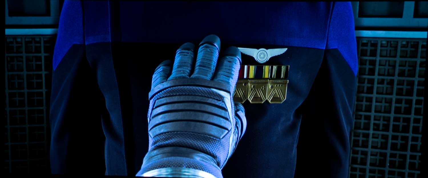
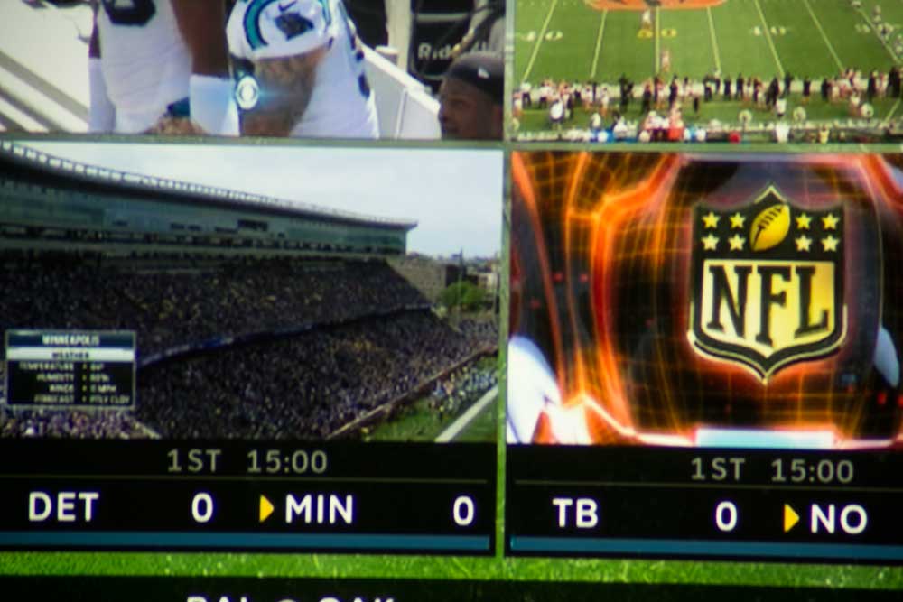
Let's look at the images above. All but the football images at the end (full screen and close-up are 4K UHD images. The first pair from Ghostbusters gives you a pretty good idea on 4K UHD sharpness.
The images though of particular interest, relate to my comments, that there's a difference between real, and perceived sharpness. After the dock image, are two close-ups of the upper right side of the image. The first of those is the HT3550, the second, is the Epson HC5050UB.
For several reasons, the BenQ is technically sharper - pixel shifting 4x instead of 2x total, but also because there is at least a little inherent misalignment in the Epson's 3LCD panels (all 3 "chip" projectors). Turn off all the special processing and the BenQ looks sharper. But turn that stuff on, and you get what you see here. Look at the words on the sign. They come out more contrasty (due to processing) on the Epson. T/hat tends to make you shout - it looks sharper. It does! It just really isn't any sharper or detailed, and in reality is a little less sharp. That is our learning moment today. That Epson delivers a little "hardness" to the image as part of all that processing, but you are only likely to notice that at all, perhaps, on some facial close-ups while viewing. Remember too, motion softens the look, so sharpness differences on these stills seem a bit greater than when watching the projectors live!
I spotted some de-focusing on the first (pre-production unit), but any de-focusing as the projector fully warmed up, on the production unit was barely detectable, and a non-issue. If we look hard enough we can find some de-focusing upon full warm up, on many projectors, but it is usually very slight.
4K UHD DLP projectors, whether they use the 1920x1080x4 DLP chipset (0.47”) or the larger 2716x1528x2) should appear a little sharper than any of the 1920x1080x2 pixel shifters. It is less because of the extra pixel shifting, and more because 3LCD and LCoS projectors use three separate chips (red, green, blue), that they have to converge. That creates some mis-convergence. The overall trade-off, of course, is that these DLPs use a color filter wheel which can cause some of us to see rainbows – RBE. Ah, there are always trade-offs.
This player has some comparison images and some close-ups. Perhaps the most important images though are the close-ups from Journey to the South Pacific!
The thing to consider, as I like to point out – today’s projectors have so much assorted image processing that you can make even a 1080p pixel shifter 3LCD, on 4K content eem sharper than a 4K UHD, or even a lower price native 4K projector. A touch more smart contrast applied makes things stand out better, so you think sharper, or more detailed.
So check out the big sign on both the HT3550 and the accompanying same image on the new Epson 5050UB (my new reference projector for the next year). Interesting that the words are darker, and stand out better, making them more readable, on the Epson.
That doesn’t mean better. I’ve long said that Epson’s have great image processing, but the end result not only makes you think it is sharper/more detailed but also that the image seems a bit hard by comparison. You might not notice that in this close-up but it sometimes is slightly noticeable on close-ups of faces.

